This tutorial builds on the introductory tutorial to extend skills in methods of working with and symbolizing vector data within QGIS or Python. After completing this tutorial you will learn how to perform a spatial join and how to manipulate layer symbology based on attribute information.
The exercise in this tutorial is provided in two versions: one for QGIS, and one for Python using pandas and GeoPandas. Both cover the same steps with the same data and have the same deliverable. Choose one or the other.
Deliverables
One map using quantitative symbology to convey information about housing in NYC composed as a 8.5x11 page (landscape or portrait orientation) exported as a PDF. Your map must include standard map elements outlined in the layout portion of this tutorial.
Data
- 2018-2022 American Community Survey, 5 year estimates for housing and tenure variables at the census block level
- 2022 Census blocks for New York City
Please download both datasets from Canvas here in the tutorial 02 folder.
Save them in the data folder that you have created for working on tutorials in this course.
Both datasets are distributed by the IPUMS National Historical Geographic Information System — a great resource for cleaned data from the US census as well as historic census files.
Exercise (QGIS)
Adding data
Open your .qgz file from the introductory tutorial.
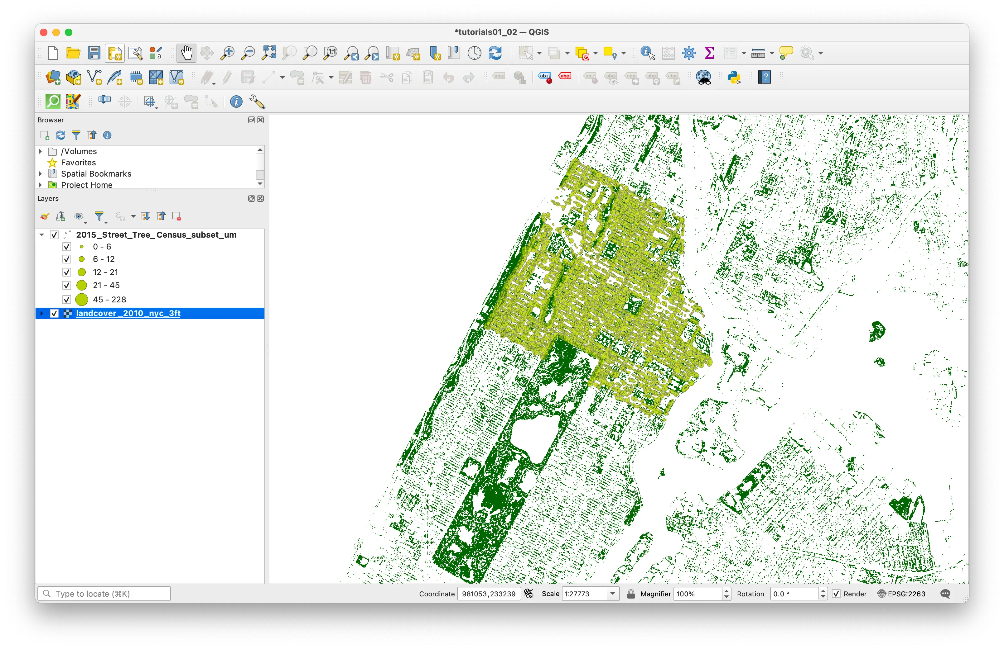
From the top menu bar select Layer and then Add Layer > Add Vector Layer.
When the Data Source Manager menu appears click on the ... and navigate to the data folder for this assignment and add the shapefile of census block groups for New York City that you downloaded above: nyc_block_grp_2022.shp.

Your project will look something like this.
Open the attribute table for the census block groups you have just added to your project.
You’ll notice there is a lot of identifying information (a GISJOIN field, a GEOID, codes for the state and county of each census block) but there is no other information about demographics or any other information about things going on inside these census block groups. Data is released from the U.S. Census as tabular files .csv format generally) and in order to visualize information about housing units and rents New York City you must first join this tabular information to the census block groups.
This is something called a table join where we are able to attach additional attribute information to a vector dataset if there is a common identifier field with unique values in the vector dataset and the tabular data with further attribute information.
Next we will add the tabular data containing census information about housing to your project.
Examining metadata
Before you add the table to your QGIS project, take a look at the codebook and metadata included for this dataset: nhgis0012_ds262_20225_blck_grp_codebook.txt. This is generated automatically when you download data from NHGIS and is very helpful for understanding the contents of the data you are about to work with as well as any coded field names.
You’ll see that there is information in this dataset about housing tenure (how many households rent versus own the place that they live), as well as median contract rent, and median gross rent. Notice that AQSQE001 is the field name for the total number of housing units; AQSQE002, is total owner-occupied housing units; and AQSQE003 is the total number of renter-occupied housing units. B25064 is the field that contains values for the median gross rent.
Notice also that there is a field GEOID. This is the unique identifier for each census block group and is the field that you will use to perform a table join between this tabular information about housing, and the census block group geometry.
Now, add the tabular data containing census information about housing to your project.
From the top menu bar select Layer and then Add Layer > Add Delimited Text Layer. Navigate to your data folder and add the nhgis_nyc_20225_blck_grp_housing.csv file. Under the Geometry Definition section select No geometry (attribute only table). Select Add.
Open the attribute table for the census table about housing tenure. Each row contains information about one census block. The TL_GEO_ID field contains unique geographic identifiers for each census block group that are identical to the values in the GEOID field in the census block group vector dataset. This is the field you will use to perform the table join.
Performing a table join
Now that you have added the table of data from the US census about housing we will perform a table join to associate this data with the census block groups it refers to.
By performing a table join we will be able to make a map from data that was previously only available as a table. This is a form of creating spatial data. It is important to note that a table join is a temporary relationship, you are associating information from a table with a vector dataset however you have not done anything to change either of the underlying datasets.
In a table join you are able to append additional attribute information from a table to a vector dataset if two conditions are met:
- there is a common identifier field in the vector dataset and the tabular dataset with further attribute information
- that common identifier field has unique values (i.e. in our case no two census block groups have the same ID)
In a table join there is a target layer and a join layer. The target layer is the layer you are joining information to (in this case the census block group boundary file). The join layer is the layer you are appending information from (in this case the census Housing Tenure table).
You always initiate a table join from the target layer.
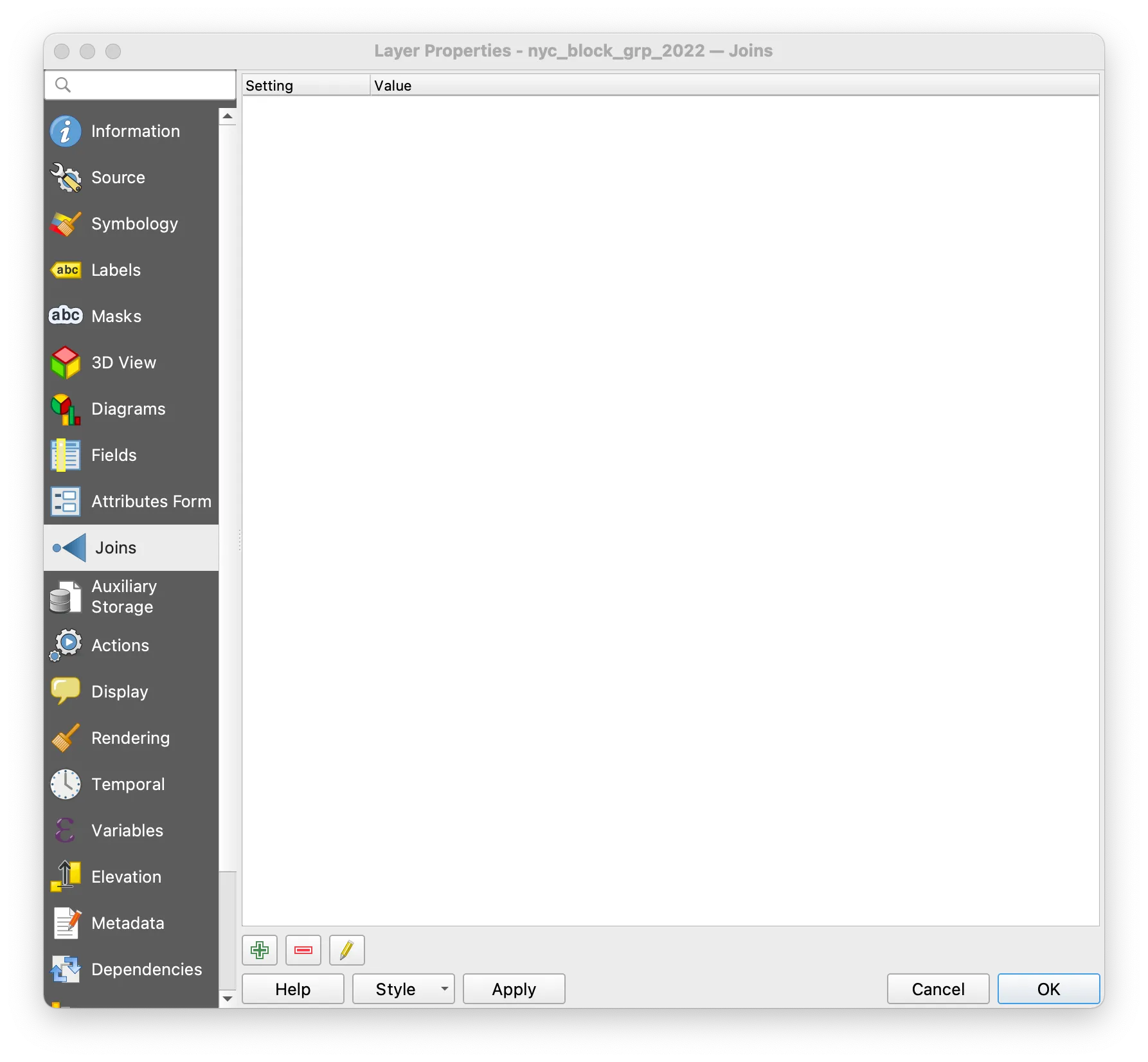
To initiate the table join open the Layer Properties menu for the census block vector dataset.
Select the Joins option in the left-hand of the Layer Properties menu. Then select the + icon at the bottom of the menu.
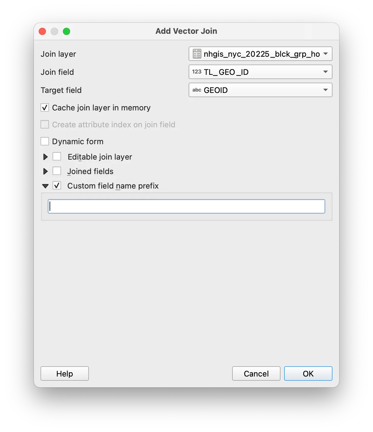
The Add Vector Join menu should appear. Make the selections shown below. Click OK.
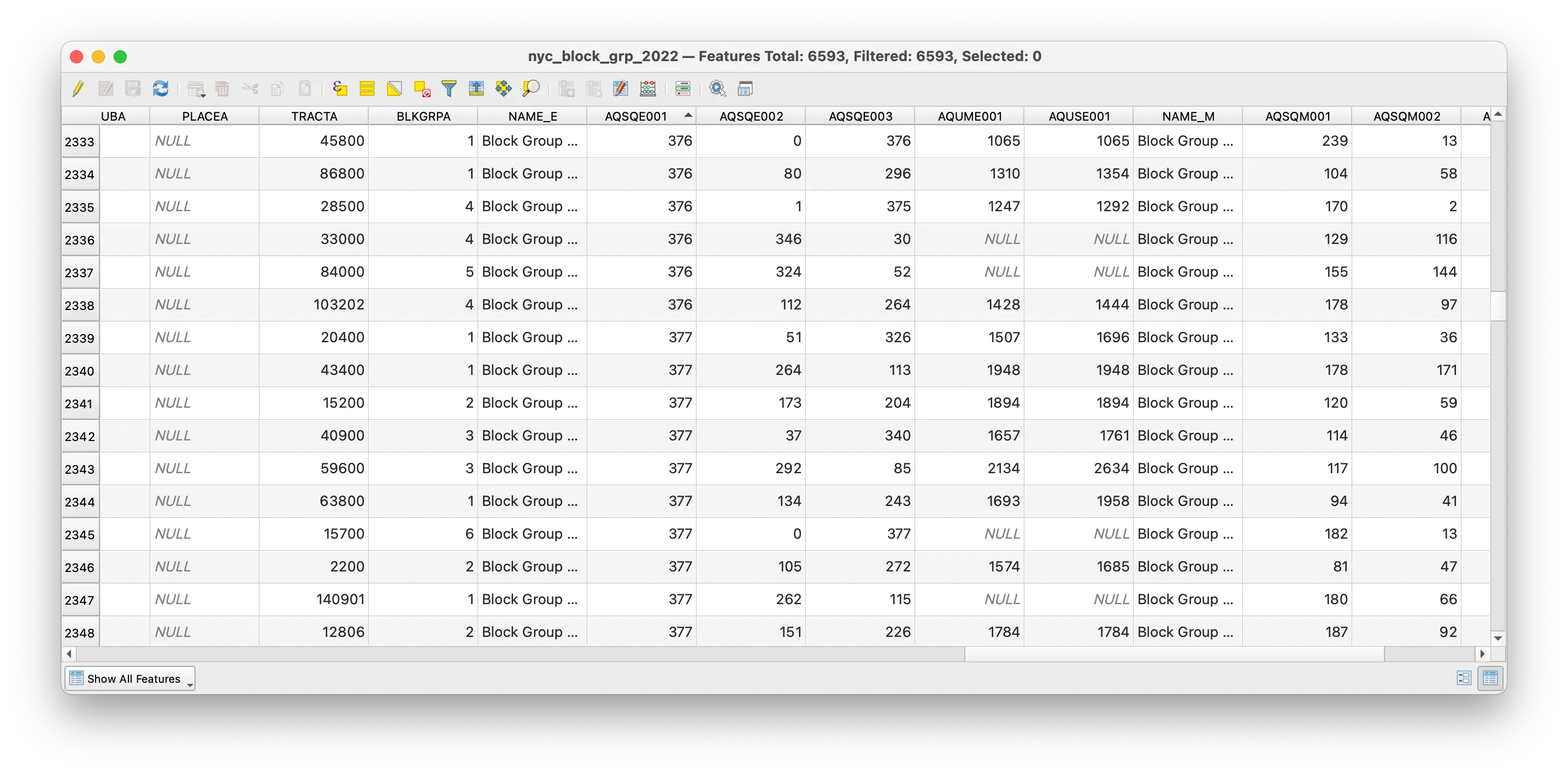
To check and see the effect of your table join open the attribute table of the NYC block groups layer. The additional fields from the housing tenure census table should have been added to the attribute table for the NYC block groups boundary file.
As noted above a table join is a temporary relationship, we have not modified the target layer’s underlying dataset, but are merely looking at an association between two datasets in our QGIS project. To permanently save the table join, we must save a copy of the target layer after we perform the table join.
Right click on the NYC block group boundary file and select Export>Save features as to save a new copy of the census block groups that will include the Housing Tenure information we added to the attribute table.
Select ESRI shapefile as the format. Click the button with three dots to the right of the File name field. Navigate to the data folder for your tutorials and save the new file there. Give it a clear file name that conveys how you changed it. nyc_block_grp_2022_joined.shp is a good option.
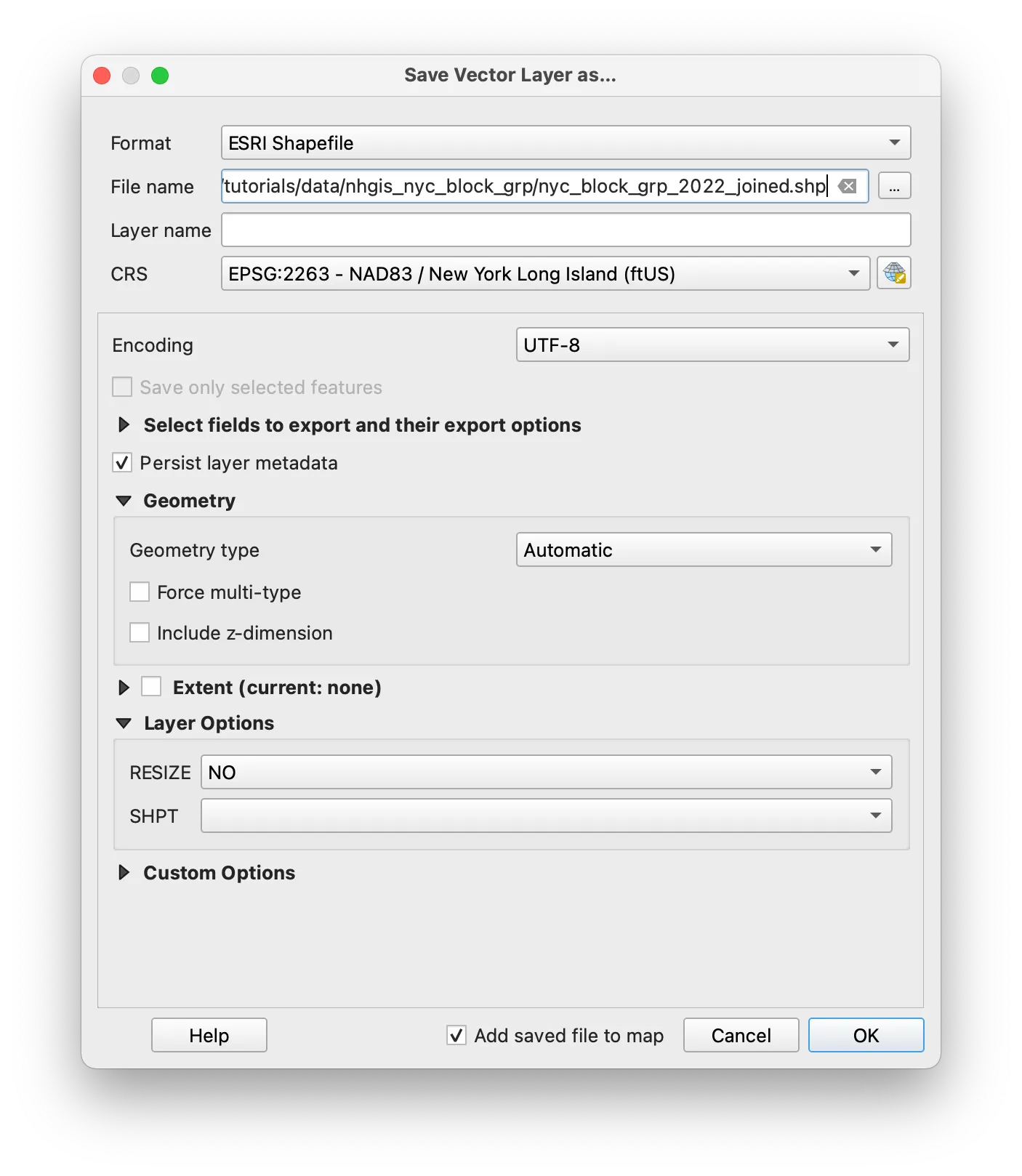
Remove the other census block group boundary layer, and the Housing Tenure table from the QGIS project, so you just have the nyc_block_grp_2022_joined.shp layer.
Symbolize values
Next you will visualize the housing-related data you have joined to your census block groups in a variety of ways.
The tutorial will walk through three approaches to visualizing quantitative values with vector data:
- a choropleth map of the total number of housing units in each census block group
- a choropleth map showing the percent of renter-occupied housing units in each census block group
- a dot density map showing 1 dot for every 100 housing units within each census block group
Choropleth map of values
Open the Symbology tab. This menu allows you to specify the symbology for this vector dataset.
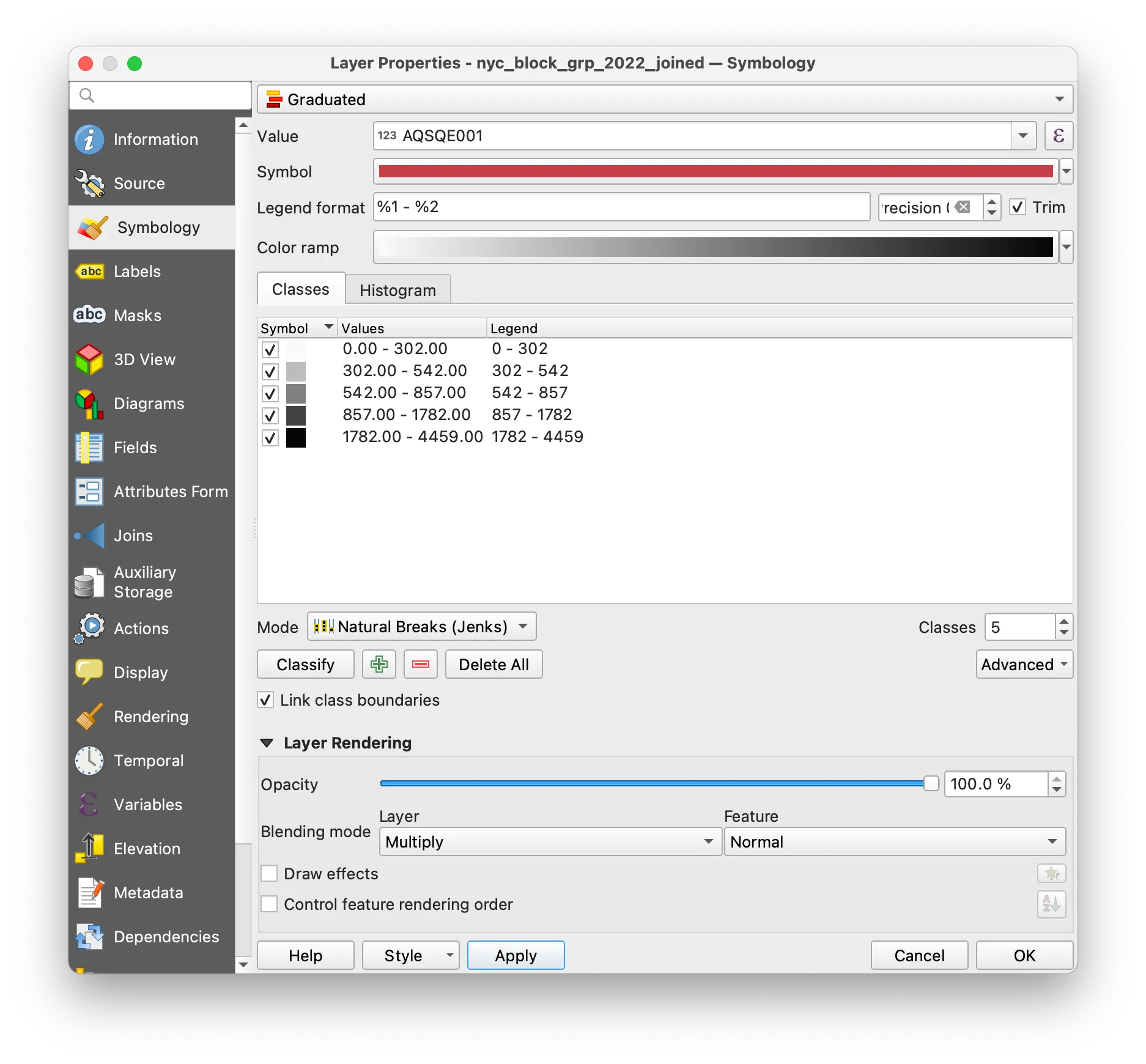
As shown in the screenshot above, select Graduated and then select the field containing values of the total number of housing units for the Value field.
Select Natural Breaks (Jenks) for the Mode and click Classify.
The classification mode determines how your data is grouped and which data values correspond to which colors on your map. The Histogram tab allows you to see the distribution of your data and shows you how the dataset is divided according to the classification scheme you chose. Experiment with changing the classification mode you have chosen and reloading values in the histogram to see how differently they divide your data.
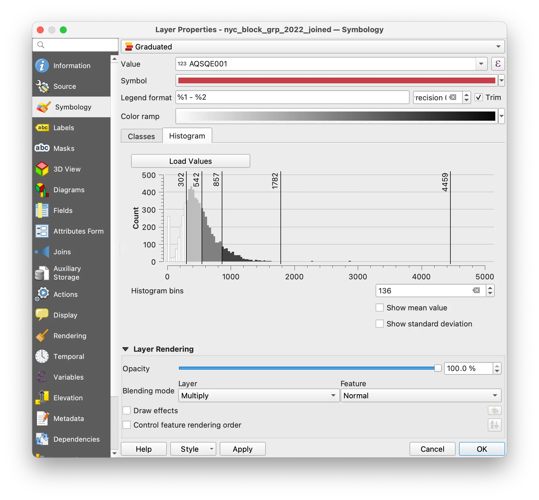
Change the Layer Rendering settings so that you can see the tree canopy raster underneath your census block groups.
Your map should look something like this:
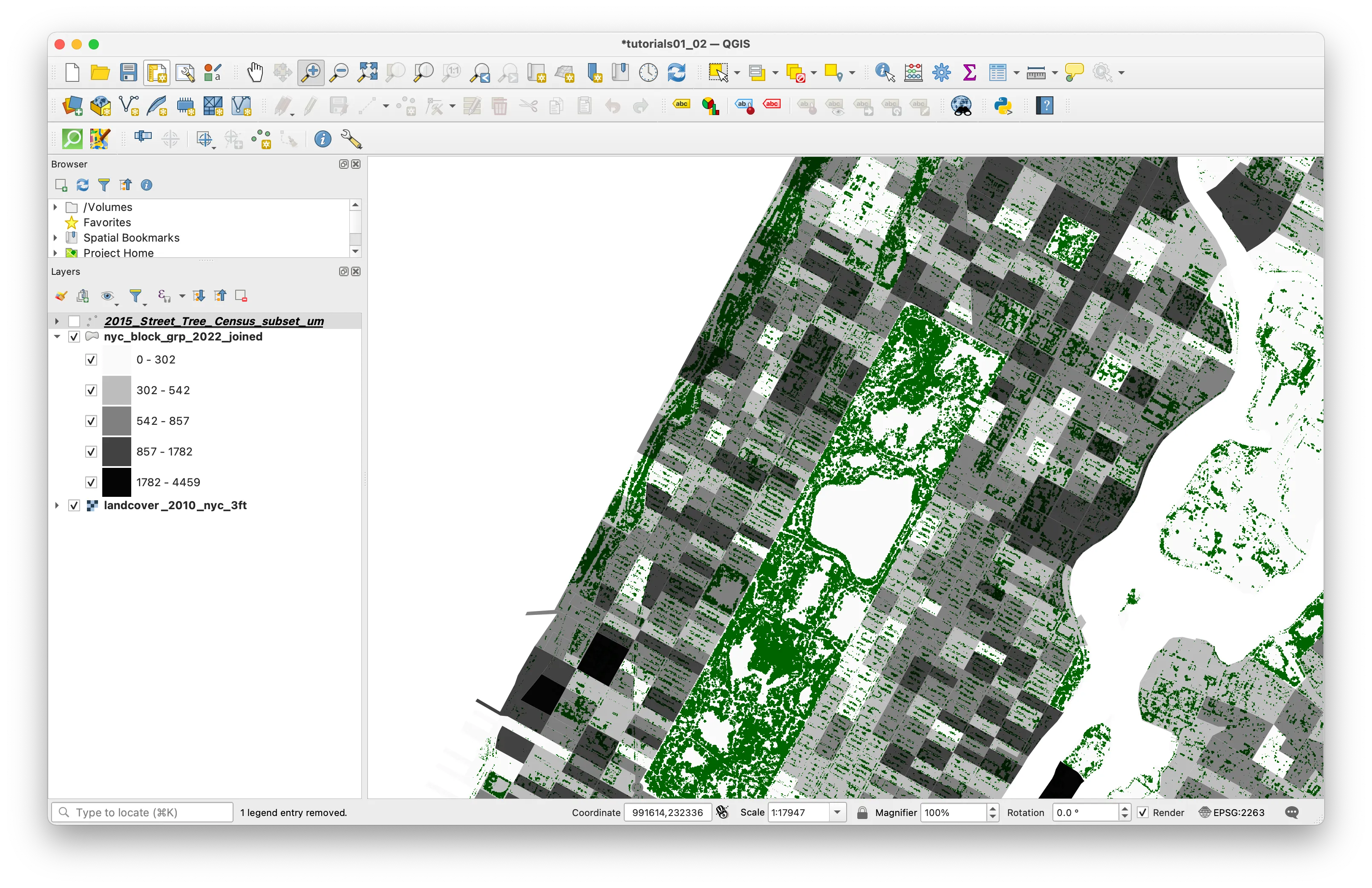
Normalized choropleth map of values
Next you will make a map of the percentage of owner-occupied housing units in each census block group — aka the number of owner-occupied housing units normalized by the total number of housing units in each census block group.
To do this you can either duplicate the NYC block groups layer (so that you retain your the styling and symbology of your total housing units choropleth map) or change the symbology of that layer.
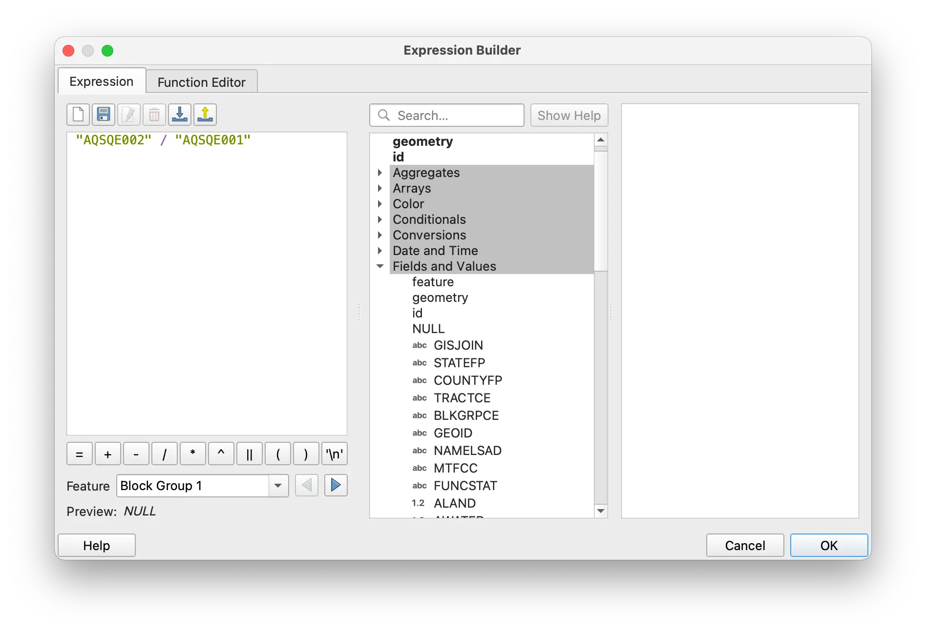
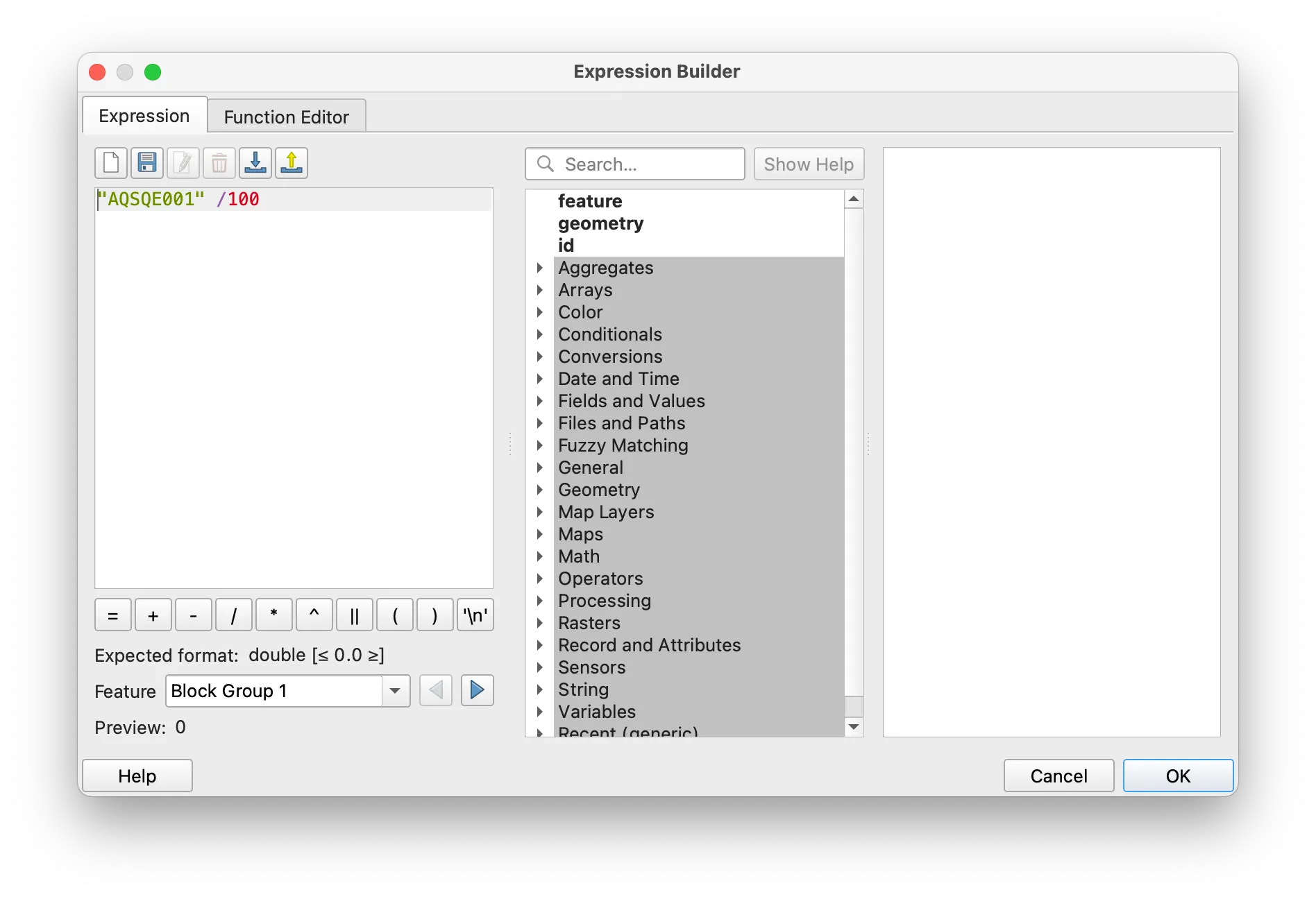
Click on the epsilon button next to the Value field. The Expression Builder should open. In it you can expand the menu for Fields and Values and click on the relevant field names to create the expression on the left. You can also type the expression as shown (using SQL syntax and the correct field names). In the case of this example we are dividing the total number of owner-occupied housing units by the total number of housing units. Click OK.
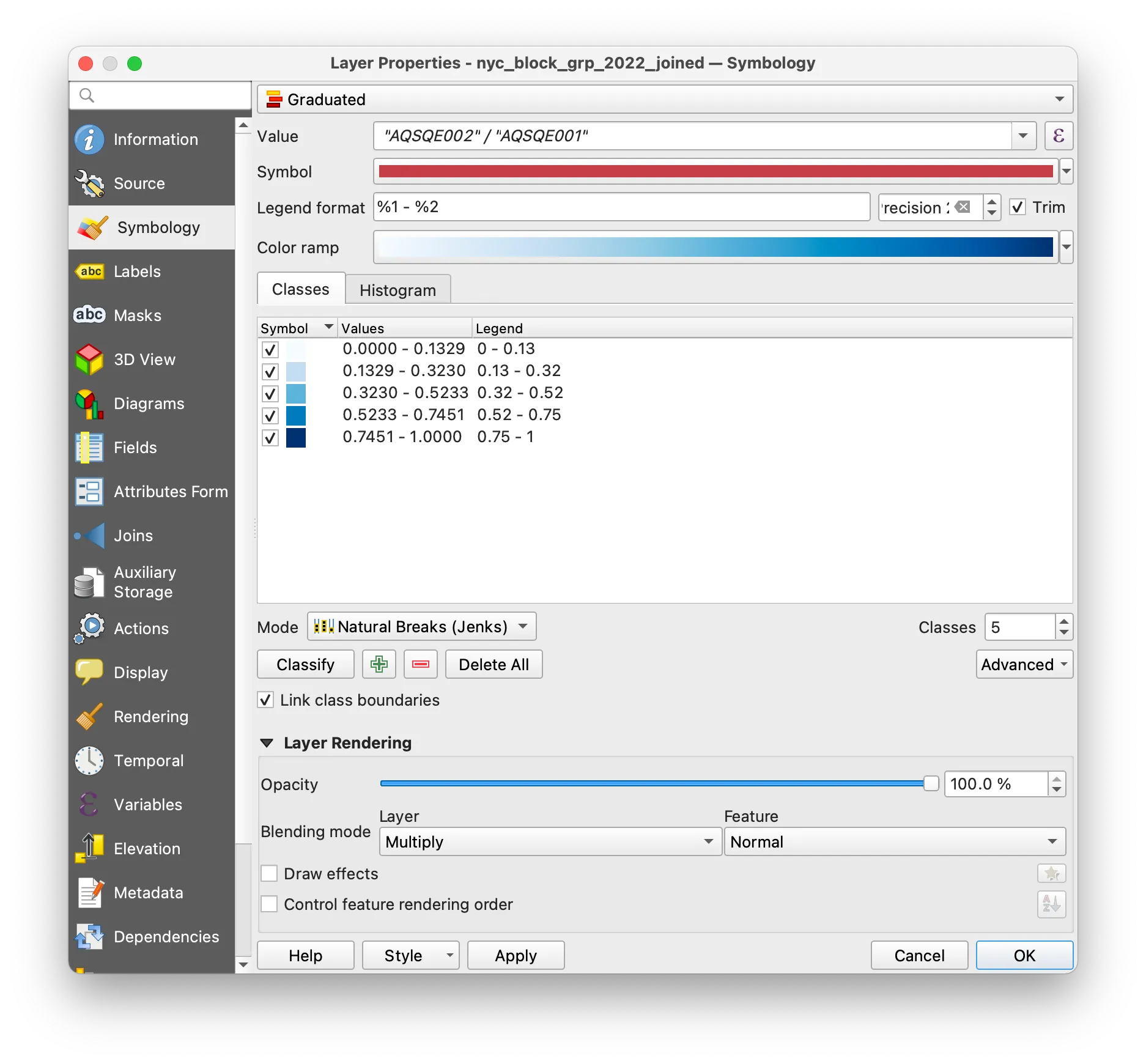
Make your choice of classification mode and color ramp in the Symbology menu. Click OK.
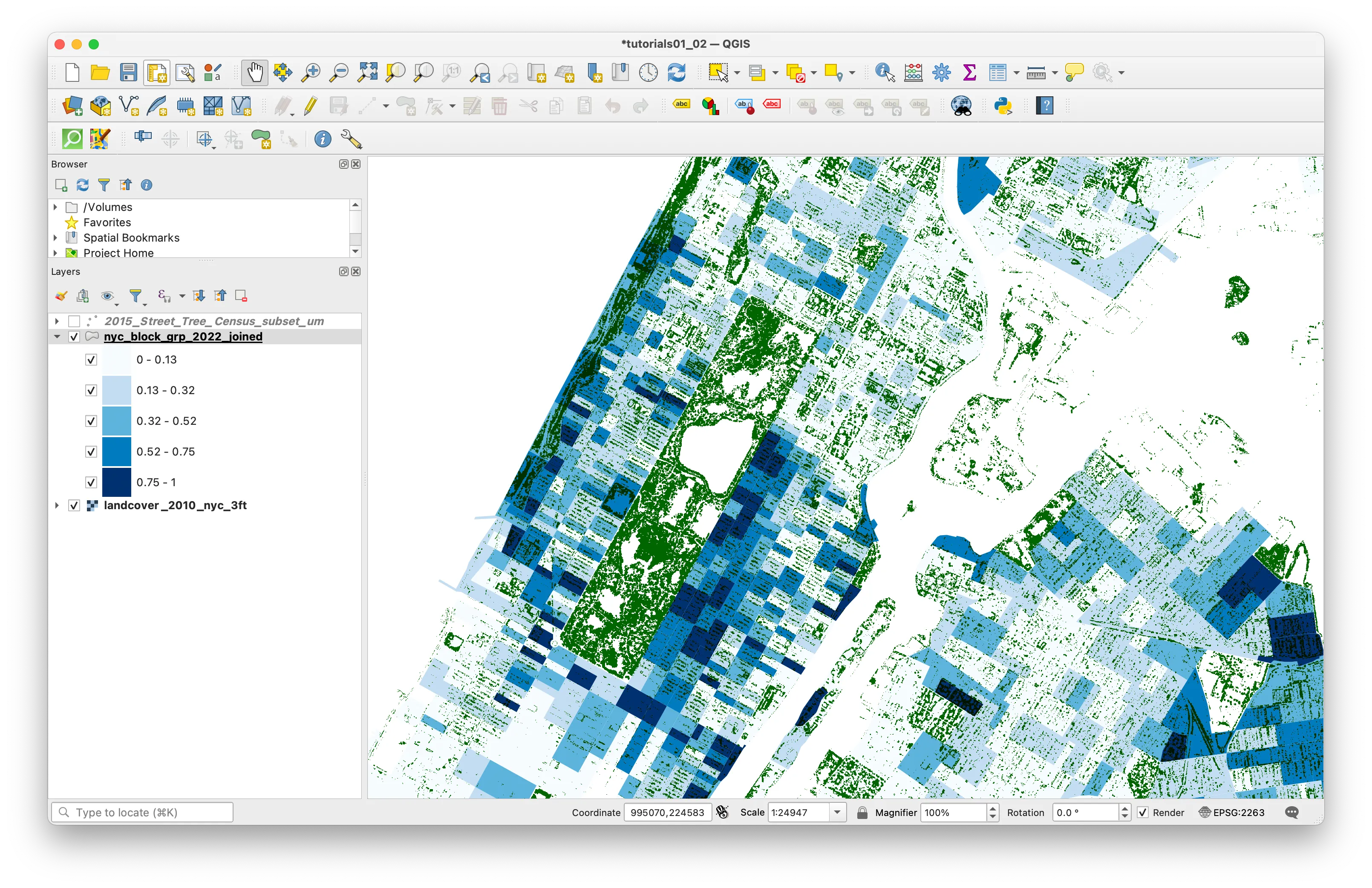
Your map should look something like this:
Dot density map
Next you will use a tool from QGIS to generate a dot density map to communicate the number of housing units using a proportional number of dots to the actual number of housing units in the census block.
Dot density maps can be powerful ways to show concentrations in ways that have less emphasis on rigid lines between given boundaries. See this example from cartographer and historian of science Bill Rankin; these from map maker Eric Fischer and this from data visualization expert Jia Zhang.
To create a dot density map showing the number of housing units in each census block you will use a tool called Random Points Inside Polygons from the Processing Toolbox. This is a tool that will create a new vector dataset with a specified number of points placed at random locations within given polygons.
If the processing tool box is not already open on your screen you can open it with the gear icon in the top tool panel.
Either search for “Random Points Inside Polygons” or expand the Vector creation section of the processing toolbox.
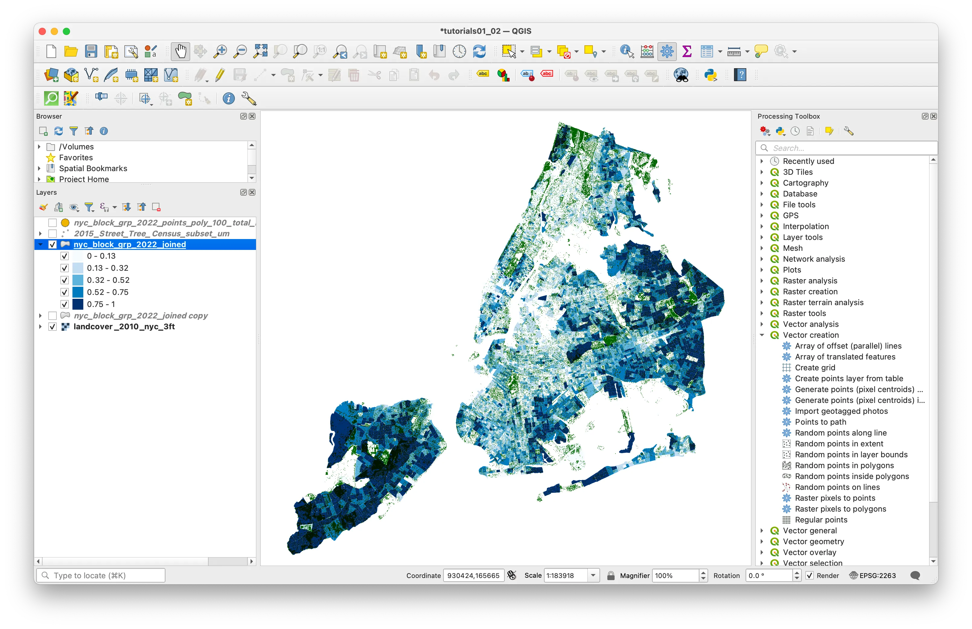
When you open the Random Points Inside Polygons tool select the epsilon button next to the Point count or density field.
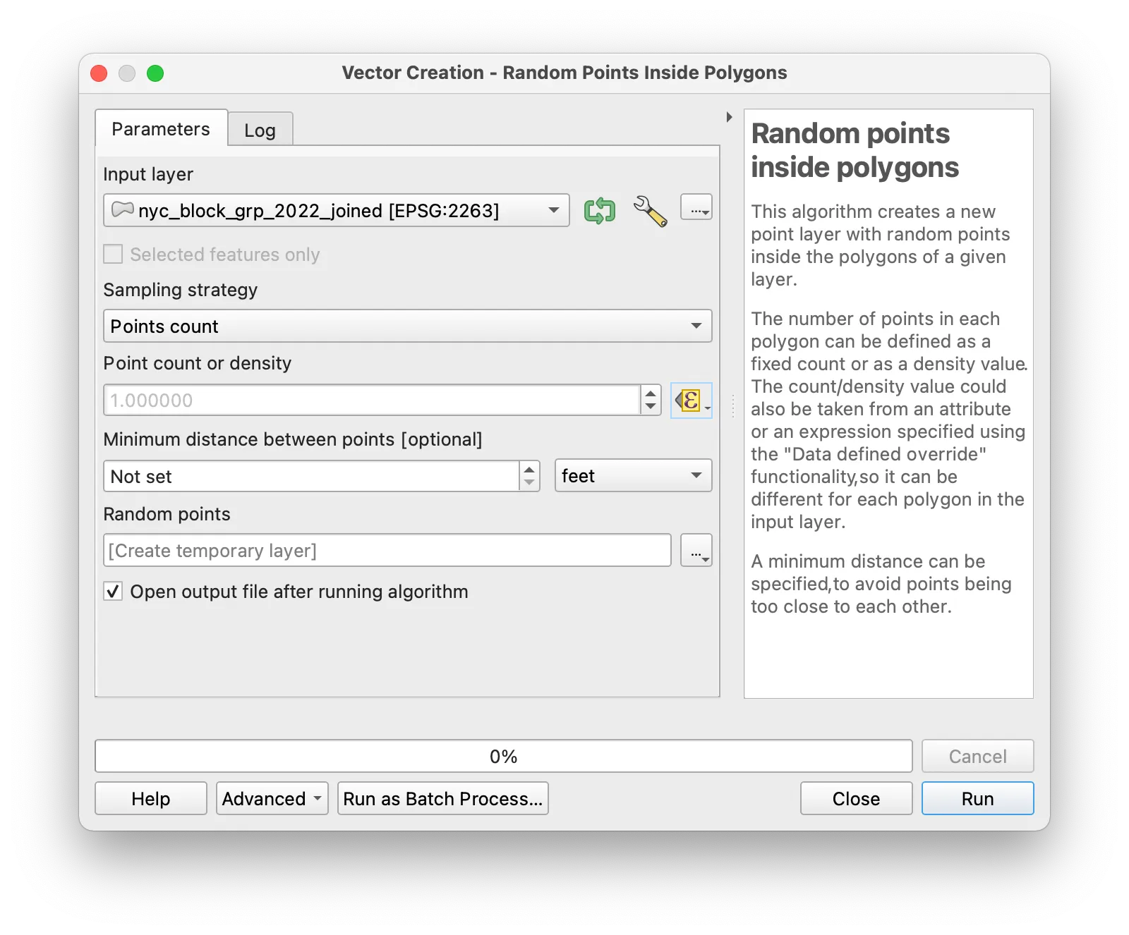
Then with the expression builder select the field from your dataset representing the total number of housing units and divide this number by 100. This will mean that there is 1 dot created for every 100 housing units (you can experiment with different values in the denominator here to get your desired density of dots). Click OK in the Expression Builder. Note that we have not specified a location to save the new vector dataset you are creating (the Random points field states [create temporary layer]. Click Run for the Random Points Inside Polygons tool.
Your map should now look something like this:
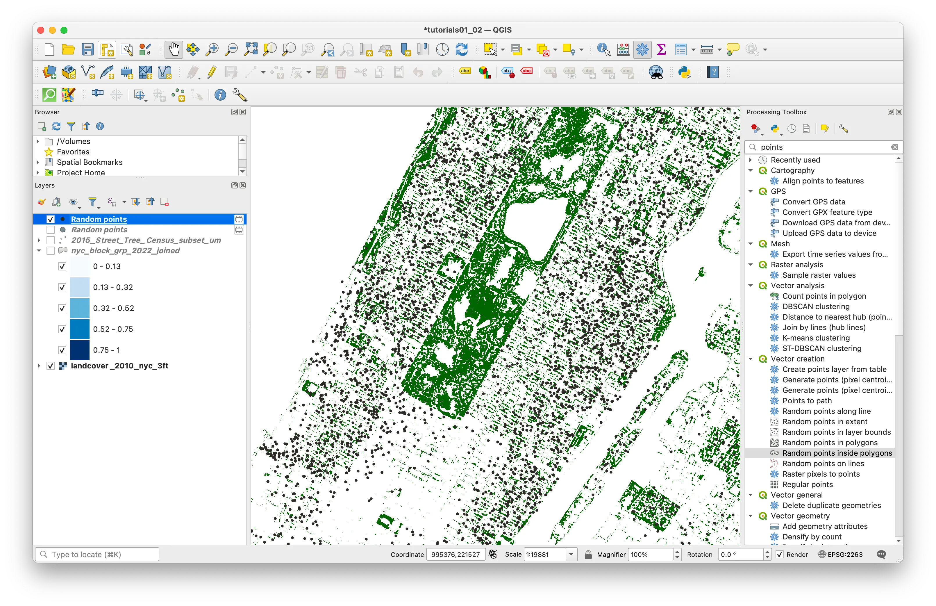
When generating the random points we created something called a temporary layer — this is a way to use QGIS to create new datasets but only store them in temporary memory. If you close your QGIS project they will be deleted. This is a helpful feature to avoid producing many datasets while you adjust parameters (such as the number of dots) to obtain your desired result. But once you have a result you are happy with to retain the data after closing your QGIS project you must export the layer to save it as a new vector dataset.
To do this right click on the Random points layer in the layers panel that you would like to save. And select Export>Save features as. Click on the ... button to specify a location to save your new dataset and give it a name. Specify the coordinate reference system you would live to save the file with (you should use EPSG: 2263 for any maps of NYC). Check the box next to Add saved file to map. Click OK
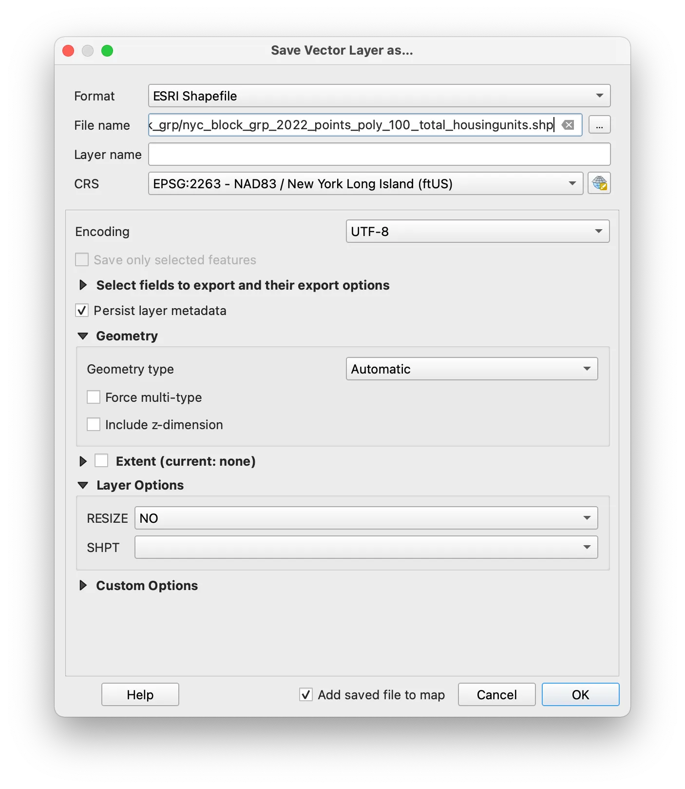
Your new vector dataset of points representing the number of housing units in each census block group in New York City should now be added to the map.
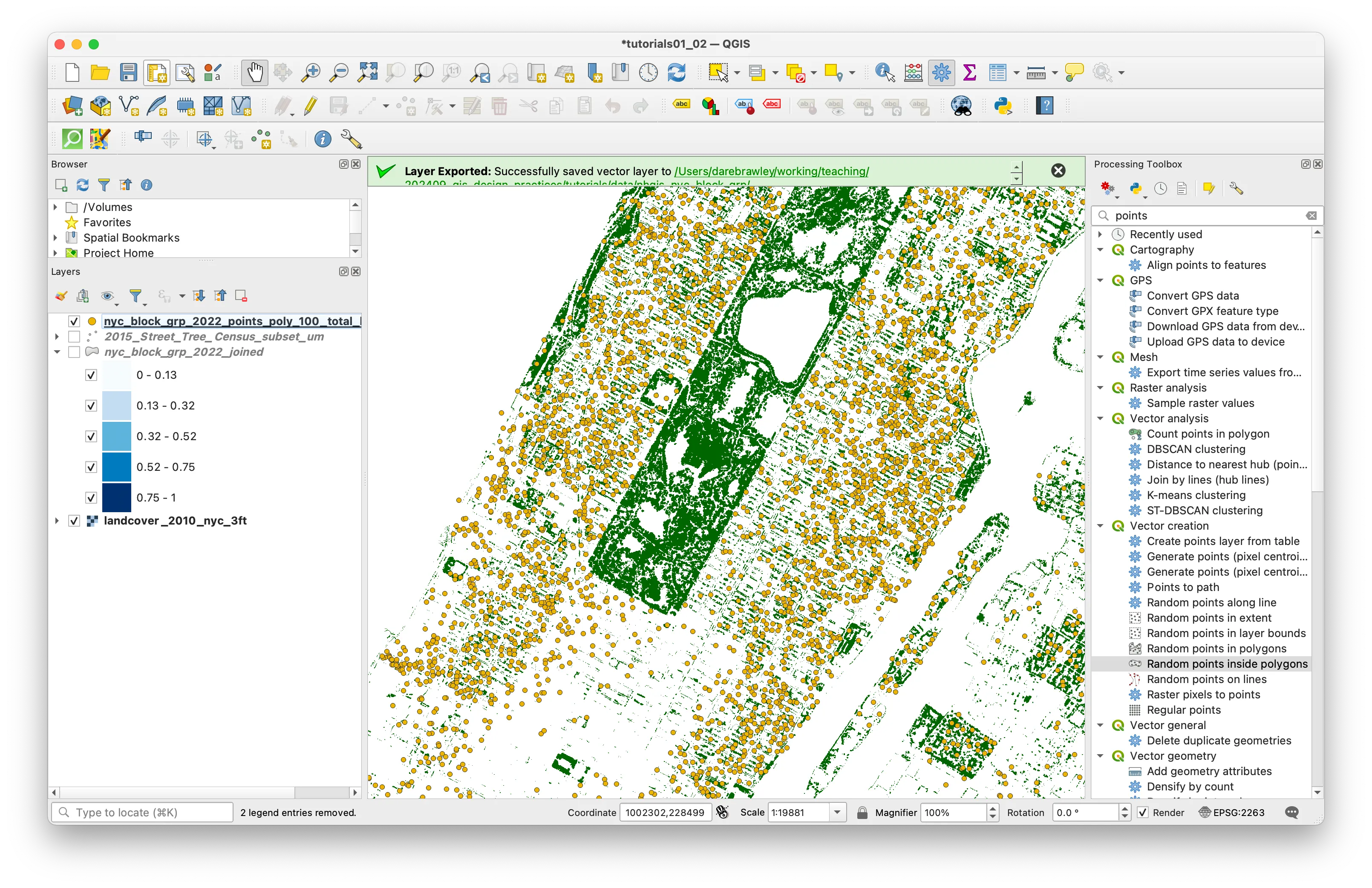
Now experiment with any of the above symbology methods to create a map of your choice expressing something about housing in NYC. Create a print layout with a legend and key map elements and export a PDF of your map.
Upload one map to canvas that uses quantitative symbology to convey information about housing in NYC composed as a 8.5x11 page (landscape or portrait orientation) exported as a PDF. Your map must include standard map elements outlined in the layout portion of tutorial 01.
Exercise (Python)
This version of the exercise follows the same steps as the QGIS exercise above, using pandas and GeoPandas in a Jupyter notebook in place of the QGIS interface. The data, the concepts, and the deliverable are all the same. It assumes that you already have a conda environment set up that includes geopandas, mapclassify, matplotlib, and rasterio. For more information, see the setup instructions described in the course resources page.
A note on vocabulary as you move between the two versions: a vector layer in QGIS is a GeoDataFrame in GeoPandas, the attribute table is the rows and columns of that GeoDataFrame, a field is a column, and a table with no geometry is a plain pandas DataFrame.
Adding data
Activate your conda environment, and create a new Jupyter notebook. Save it in that folder (next to your data folder) with a clear name like tutorial02.ipynb.
In the first cell of your notebook import the libraries that you will use throughout this tutorial. Remember to activate your environment before starting your Jupyter notebook so that it can find the libraries you installed.
import geopandas as gpdimport mapclassifyimport matplotlib.pyplot as pltimport numpy as npimport pandas as pdNext add the shapefile of census block groups for New York City that you downloaded above: nyc_block_grp_2022.shp. The paths in this tutorial assume that you unzipped the data for this tutorial inside your data/original folder. Adjust them if you saved the data somewhere else.
block_groups = gpd.read_file( "data/tutorial02-data/nhgis_nyc_block_grp/nyc_block_grp_2022.shp")Get a basic sense of what we’re working with by plotting the block groups. You should see a map of New York City with the census block groups outlined.
block_groups.plot()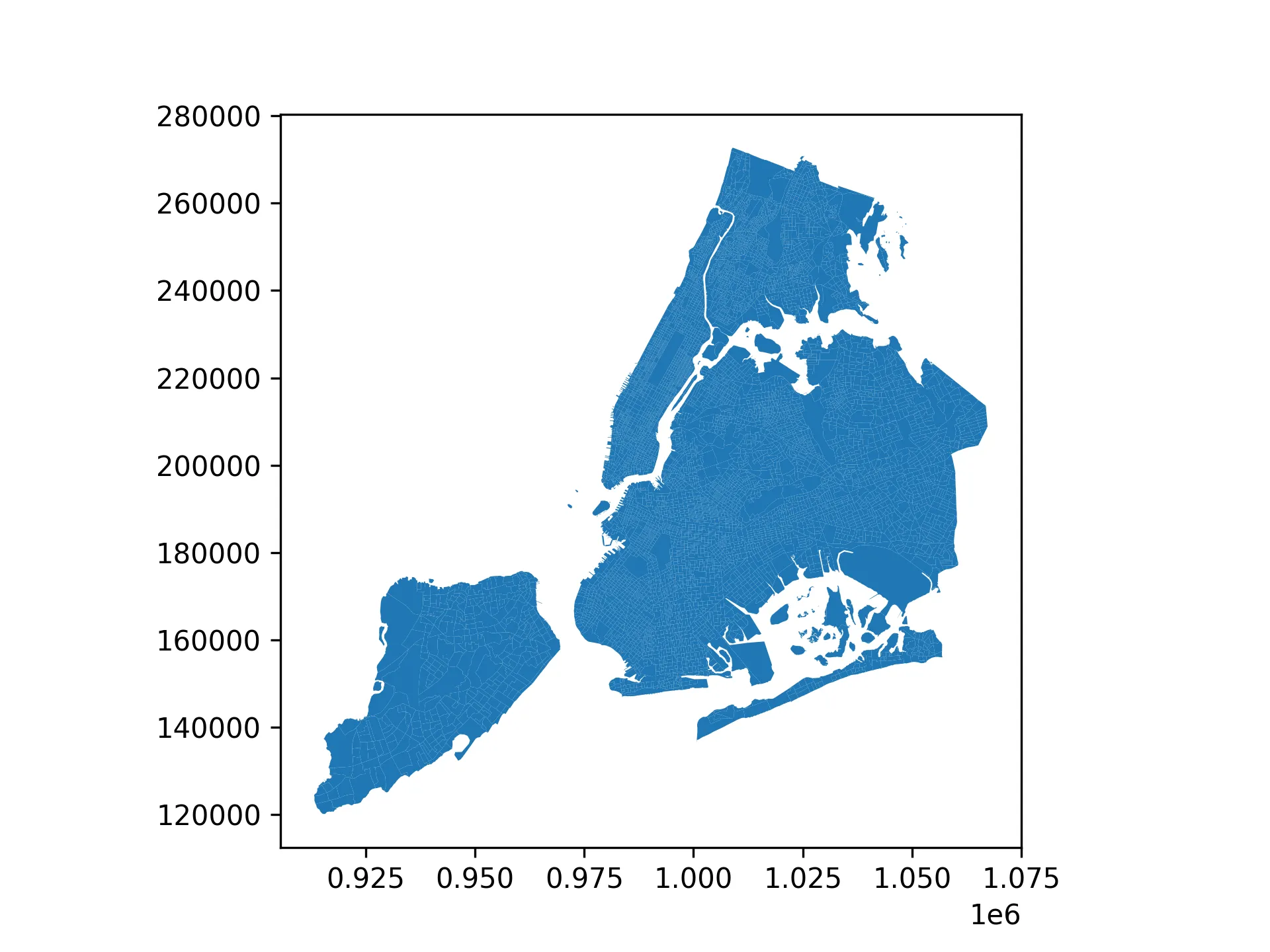
The output will look something like this.
Just as you would check the layer properties and open the attribute table in QGIS, take a look at what you have just read in. The first line below shows the first five rows of the attribute table. The next two report the number of rows and columns, and the coordinate reference system.
block_groups.head()You should be able to see the first five rows of the dataset and the attributes of each. As you can see, these are mostly identifiers and base descriptors, with no information about the people or other socio-demographic properties of these census areas.
          GISJOIN STATEFP COUNTYFP TRACTCE BLKGRPCE         GEOID  \0  G36000500001001      36      005  000100        1  3600500010011  G36000500002001      36      005  000200        1  3600500020012  G36000500002002      36      005  000200        2  3600500020023  G36000500002003      36      005  000200        3  3600500020034  G36000500004001      36      005  000400        1  360050004001
        NAMELSAD  MTFCC FUNCSTAT      ALAND  AWATER     INTPTLAT  \0  Block Group 1  G5030        S  1677210.0     0.0  +40.79111361  Block Group 1  G5030        S    89013.0     0.0  +40.81396332  Block Group 2  G5030        S   195476.0     0.0  +40.81139673  Block Group 3  G5030        S   163616.0     0.0  +40.80824524  Block Group 1  G5030        S    62874.0     0.0  +40.8139792
       INTPTLON   Shape_Leng    Shape_Area  ORIG_FID  \0  -073.8826858  5337.031119  1.677210e+06    2028231  -073.8608664  1253.660382  8.901347e+04    2081402  -073.8600538  3862.477414  1.954764e+05    2081413  -073.8567226  2019.237229  1.636185e+05    2028244  -073.8573467  1451.109087  6.287329e+04    208142
                                            geometry0  POLYGON ((1015582.61 230043.615, 1016411.575 2...1  POLYGON ((1023634.415 235638.799, 1023497.987 ...2  POLYGON ((1023634.415 235638.799, 1023790.855 ...3  POLYGON ((1024217.921 234636.372, 1024263.164 ...4  POLYGON ((1024217.921 234636.372, 1024074.876 ...
To get a sense of the size of the dataset and the coordinate reference system, run the following code:
print(block_groups.shape, block_groups.crs)There are 6,593 census block groups and has 17 columns that represent these geometries. The dataset already uses EPSG:2263, the New York State Plane coordinate reference system that you worked with in tutorial 01.
As mentioned, above, there is not yet any indication of who lives in these zones or any other socio-demographic information. That data is released from the U.S. Census as tabular files (“.csv” format generally) and in order to visualize information about housing units and rents in New York City you must first join this tabular information to the census block group geometries.
This is something called an attribute (or table) join where we are able to attach additional attribute information to a vector dataset using a common identifier field with unique values in the vector dataset and matching attributes in the tabular data.
Next we will add the tabular data containing census information about housing to your notebook. Before we do so though, we should examine the column types of the block groups to ensure we are able to join the two datasets together.
print(block_groups.dtypes)Note how all of the identifiers are stored as strings, even if they appear to only contain numeric data. This will be important as we prepare to join the tabular data to the block groups, as the identifiers must be stored in the same format in both datasets.
Examining metadata
Before you read the table into your notebook, take a look at the codebook and metadata included for this dataset: nhgis0012_ds262_20225_blck_grp_codebook.txt. This is generated automatically when you download data from NHGIS and is very helpful for understanding the contents of the data you are about to work with as well as any coded field names.
You’ll see that there is information in this dataset about housing tenure (how many households rent versus own the place that they live), as well as median contract rent, and median gross rent. Notice that AQSQE001 is the field name for the total number of housing units; AQSQE002, is total owner-occupied housing units; and AQSQE003 is the total number of renter-occupied housing units. AQUSE001 is the field that contains values for the median gross rent (from table B25064 as specified in the codebook). One of the many benefits of using NHGIS is that you can download data across input tables with this high-quality metadata that makes it easy to understand what the data represents.
Notice also that there is a field TL_GEO_ID. This is the unique identifier for each census block group and is the field that you will use to perform the attribute join between this tabular information about housing, and the census block group geometry.
Now, add the tabular data containing census information about housing to your notebook. Because this table has no geometry you will read it with pandas rather than geopandas.
housing = pd.read_csv( "data/tutorial02-data/nhgis_nyc_20225_blck_grp_housing/nhgis_nyc_20225_blck_grp_housing.csv", index_col=0, dtype={"TL_GEO_ID": str},)housing.head()There are two options here that are worth understanding:
index_col=0tells pandas that the first column of this file is just a row number, not a field that we want to keep.dtype={"TL_GEO_ID": str}tells pandas to read theTL_GEO_IDfield as text. Left to guess, pandas will see identifiers like360050001001and read them as numbers. Recall from the above step that theGEOIDfield in the block groups is stored as text, and pandas will refuse to join a text field to a numeric field (you would see the errorYou are trying to merge on str and int64 columns). You may wonder why the Census stores these identifiers in this way: many census identifiers begin with a zero, which is silently dropped when they are read as numbers.
Each row contains information about one census block group. The TL_GEO_ID field contains unique geographic identifiers for each census block group that are identical to the values in the GEOID field in the census block group vector dataset. This is the field you will use to perform the table join. Confirm that both fields are stored as text (pandas reports text as either str or object depending on your version):
print(block_groups["GEOID"].dtype)print(housing["TL_GEO_ID"].dtype)Performing an attribute join
Now that you have added the table of data from the US census about housing we will perform a table join to associate this data with the census block groups it refers to.
By performing a table join we will be able to make a map from data that was previously only available as a table. This is a form of creating spatial data. It is important to note that a table join does not do anything to change either of the underlying datasets: in pandas the result of the join is a new GeoDataFrame that lives only in the memory of your notebook until you save it.
In a table join you are able to append additional attribute information from a table to a vector dataset if two conditions are met:
- there is a common identifier field in the vector dataset and the tabular dataset with further attribute information
- that common identifier field has unique values (i.e. in our case no two census block groups have the same ID). This is very important: if either dataset has duplicate values in the identifier field, you will unintentionally create a many-to-many join that will produce a result with more rows than the target layer. This is almost never what you want, and can be difficult to detect if you are not careful.
In an attribute/table join there is a target layer and a join layer. The target layer is the layer you are joining information to (in this case the census block group boundary file). The join layer is the layer you are appending information from (in this case the census Housing Tenure table).
You always initiate a table join from the target layer.
In pandas/geopandas a table join is called a merge, and you initiate it from the target layer by calling merge() on the block groups. Though it may be tempting to start from the housing table, this is not recommended. The result takes the type of the dataset you start from, so starting from the block groups gives you a GeoDataFrame with geometry, while starting from the housing table would give you a plain table that cannot be mapped; the geometry field would simply be stored as an object vs a native geometry type.
joined = block_groups.merge( housing.drop(columns="GISJOIN"), left_on="GEOID", right_on="TL_GEO_ID", how="left", validate="1:1",)These are the same selections that you would make in the Add Vector Join menu in QGIS:
- the first argument is the join layer. We can additionally drop the
GISJOINfield from thehousingdataset to avoid having a duplicated (and slightly different) field in the output. left_onis the target field andright_onis the join field. If you recall from before the housing dataset’sGISJOINfield is prepended with aGand has a different format than theGEOIDfield in the block groups, so we cannot use it for the join. Instead we use theTL_GEO_IDfield, which is identical to theGEOIDfield in the block groups.how="left"keeps every feature in the target layer, whether or not it finds a match in the join layervalidate="1:1"asks pandas to check condition 2 above and stop with an error if either identifier field contains duplicate values. For more information on validation options, see here.
To check and see the effect of your table join look at the result. The additional fields from the housing tenure census table should have been added to the attribute table for the NYC block groups.
print(joined.shape)joined.head()EOID NAMELSAD MTFCC FUNCSTAT ALAND ... AQSQE002 AQSQE003 AQUME001 AQUSE001 NAME_M AQSQM001 AQSQM002 AQSQM003 AQUMM001 AQUSM0010 G36000500001001 36 005 000100 1 360050001001 Block Group 1 G5030 S 1677210.0 ... 0 0 NaN NaN Block Group 1, Census Tract 1, Bronx County, N... 13 13 13 NaN NaN1 G36000500002001 36 005 000200 1 360050002001 Block Group 1 G5030 S 89013.0 ... 218 99 1604.0 2104.0 Block Group 1, Census Tract 2, Bronx County, N... 106 82 79 874.0 1452.02 G36000500002002 36 005 000200 2 360050002002 Block Group 2 G5030 S 195476.0 ... 321 379 1470.0 1899.0 Block Group 2, Census Tract 2, Bronx County, N... 256 112 245 341.0 642.03 G36000500002003 36 005 000200 3 360050002003 Block Group 3 G5030 S 163616.0 ... 319 89 1815.0 2085.0 Block Group 3, Census Tract 2, Bronx County, N... 109 100 59 138.0 389.04 G36000500004001 36 005 000400 1 360050004001 Block Group 1 G5030 S 62874.0 ... 185 118 NaN NaN Block Group 1, Census Tract 4, Bronx County, N... 157 120 150 NaN NaNThe result should still have 6,593 rows, and now has 42 columns. Note that the housing table has more rows than there are block groups (compare len(housing) and len(block_groups)). The extra rows are block groups that are entirely water, which are not included in the boundary file. Because we used how="left" they are left out of the result.
As noted above we have not modified the target layer’s underlying dataset, and the joined result exists only in your notebook, as a new variable named joined. To permanently save the joined output, we must save a copy of it as a new dataset.
Select FlatGeoBuf as the format by giving your new file the .fgb extension, and save it in the data/processed folder that you created in tutorial 01 (the folder must already exist). Give it a clear file name that conveys how you changed it. nyc_block_grp_2022_joined.fgb is a good option.
joined.to_file("data/processed/nyc_block_grp_2022_joined.fgb")From here on you will work with joined. If you close your notebook and come back to it later you do not need to repeat the join. You can read the saved result directly with joined = gpd.read_file("data/processed/nyc_block_grp_2022_joined.fgb").
Symbolize values
Next you will visualize the housing-related data you have joined to your census block groups in a variety of ways.
The tutorial will walk through three approaches to visualizing quantitative values with vector data:
- a choropleth map of the total number of housing units in each census block group
- a choropleth map showing the percent of owner-occupied housing units in each census block group
- a dot density map showing 1 dot for every 100 housing units within each census block group
Choropleth map of values
In GeoPandas the symbology for a vector dataset is specified through the options that you pass to plot(). GeoPandas and Pandas both use matplotlib for plotting, so you can also use any of the options available in matplotlib to customize your map.
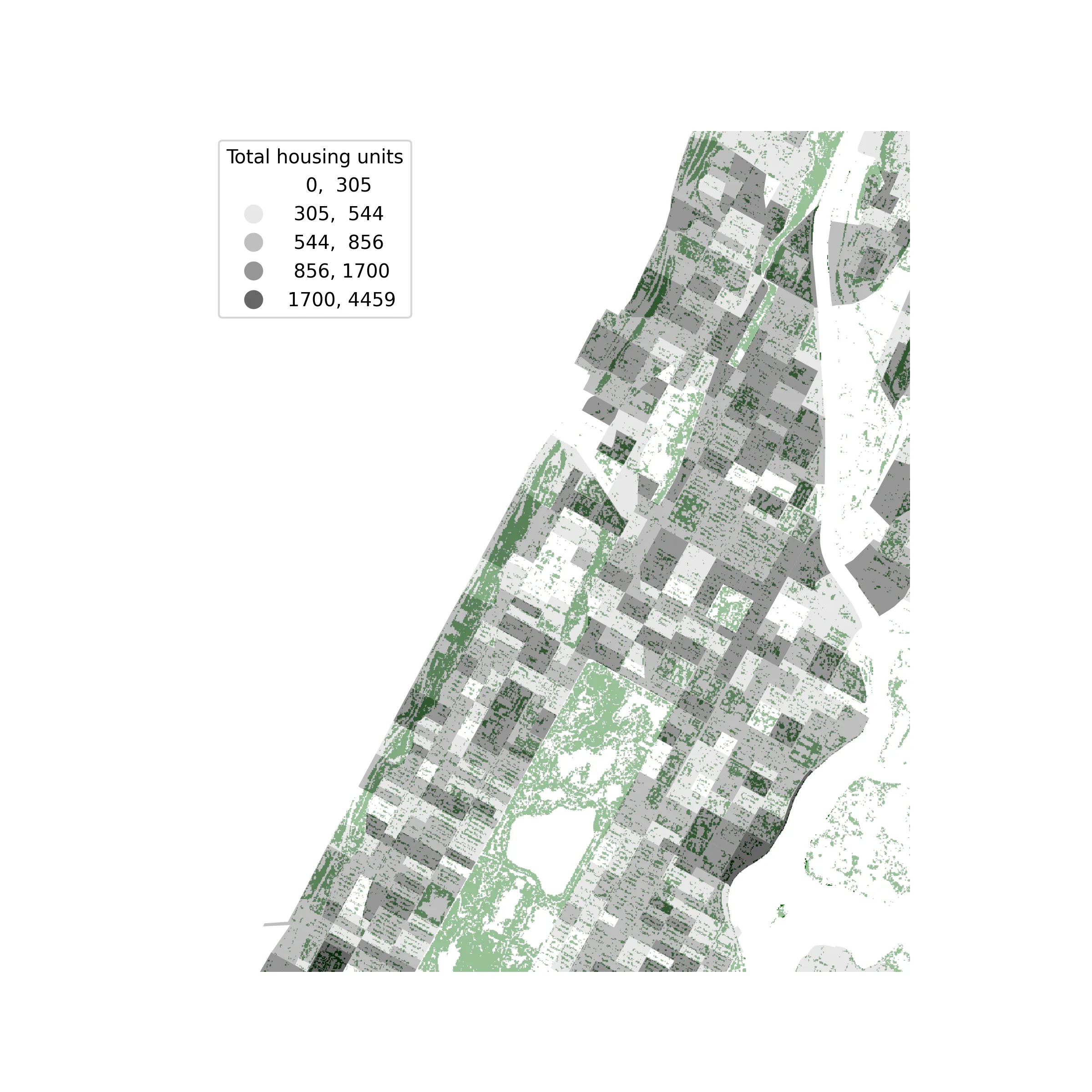
# we can dissolve by county to get an outline for each borough to plot beneath the block groupsax = joined.dissolve("COUNTYFP").boundary.plot( edgecolor="black", linewidth=0.5, alpha=0.5, figsize=(8, 8))joined.plot( ax=ax, column="AQSQE001", scheme="NaturalBreaks", k=5, cmap="Greys", edgecolor="white", linewidth=0.1, legend=True, legend_kwds={"title": "Total housing units", "fmt": "{:.0f}", "loc": "upper left"},)ax.set_axis_off()These options correspond to the choices in the QGIS Symbology tab. Passing a column and a scheme is the equivalent of selecting Graduated: column is the Value field, here the field containing values of the total number of housing units. scheme is the Mode, here NaturalBreaks for Natural Breaks (Jenks). k is the number of Classes, and cmap is the Color ramp (any matplotlib colormap name will work).
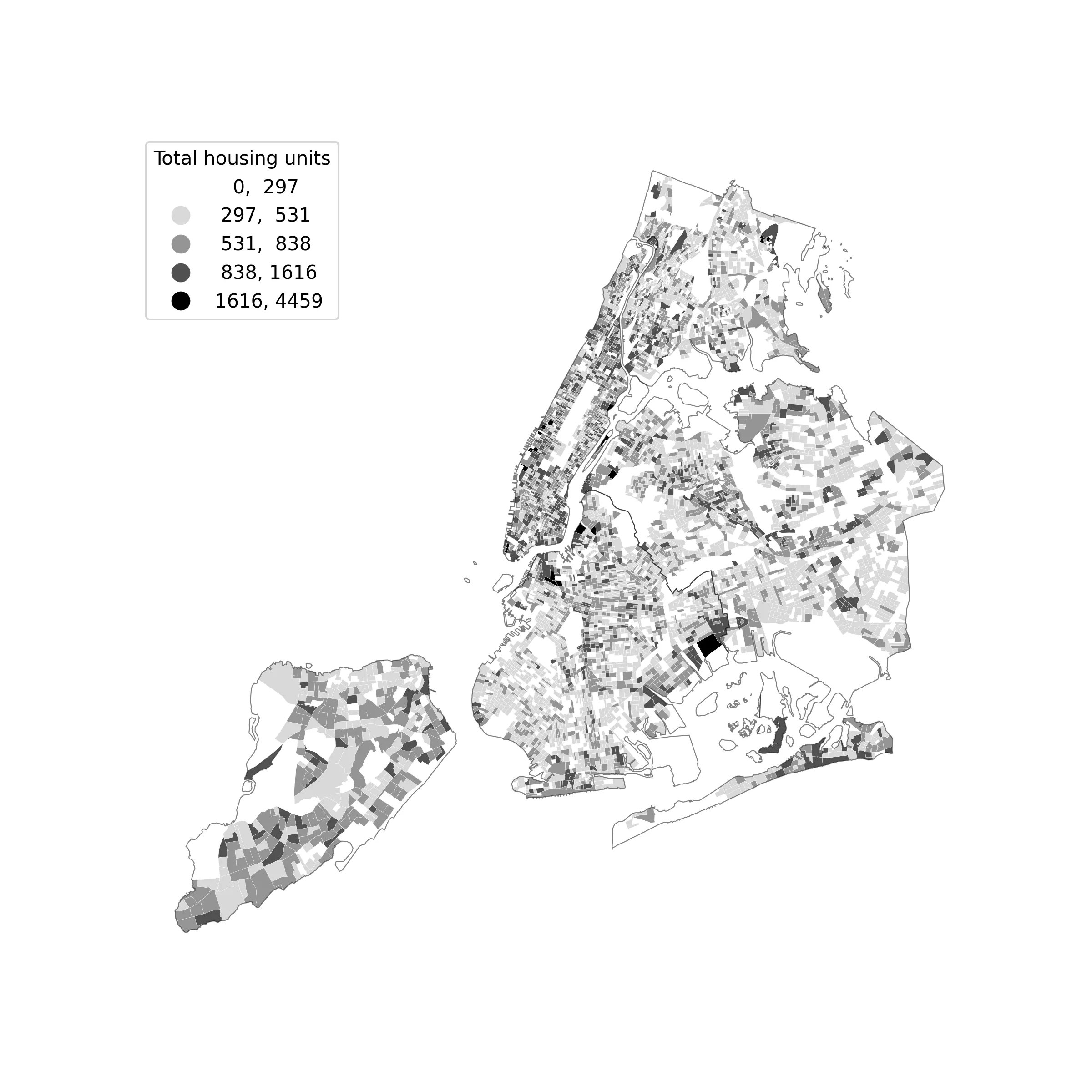 *
*
The classification scheme determines how your data is grouped and which data values correspond to which colors on your map. The classification is done by a library called mapclassify, which you can also use directly to see the distribution of your data and how the dataset is divided according to the classification scheme you chose.
classes = mapclassify.NaturalBreaks(joined["AQSQE001"], k=5)classesThis prints the range of values in each class and the number of block groups that fall within it.
NaturalBreaks
     Interval        Count--------------------------[   0.00,  305.00] |  1451( 305.00,  544.00] |  2780( 544.00,  856.00] |  1723( 856.00, 1700.00] |   622(1700.00, 4459.00] |    17
To see these breaks against the distribution of your data, draw a histogram and add a vertical line at each class break:
fig, ax = plt.subplots(figsize=(8, 4))ax.hist(joined["AQSQE001"], bins=100, color="grey")for class_break in classes.bins: ax.axvline(class_break, color="red", linewidth=1)ax.set_xlabel("Total housing units")ax.set_ylabel("Number of census block groups")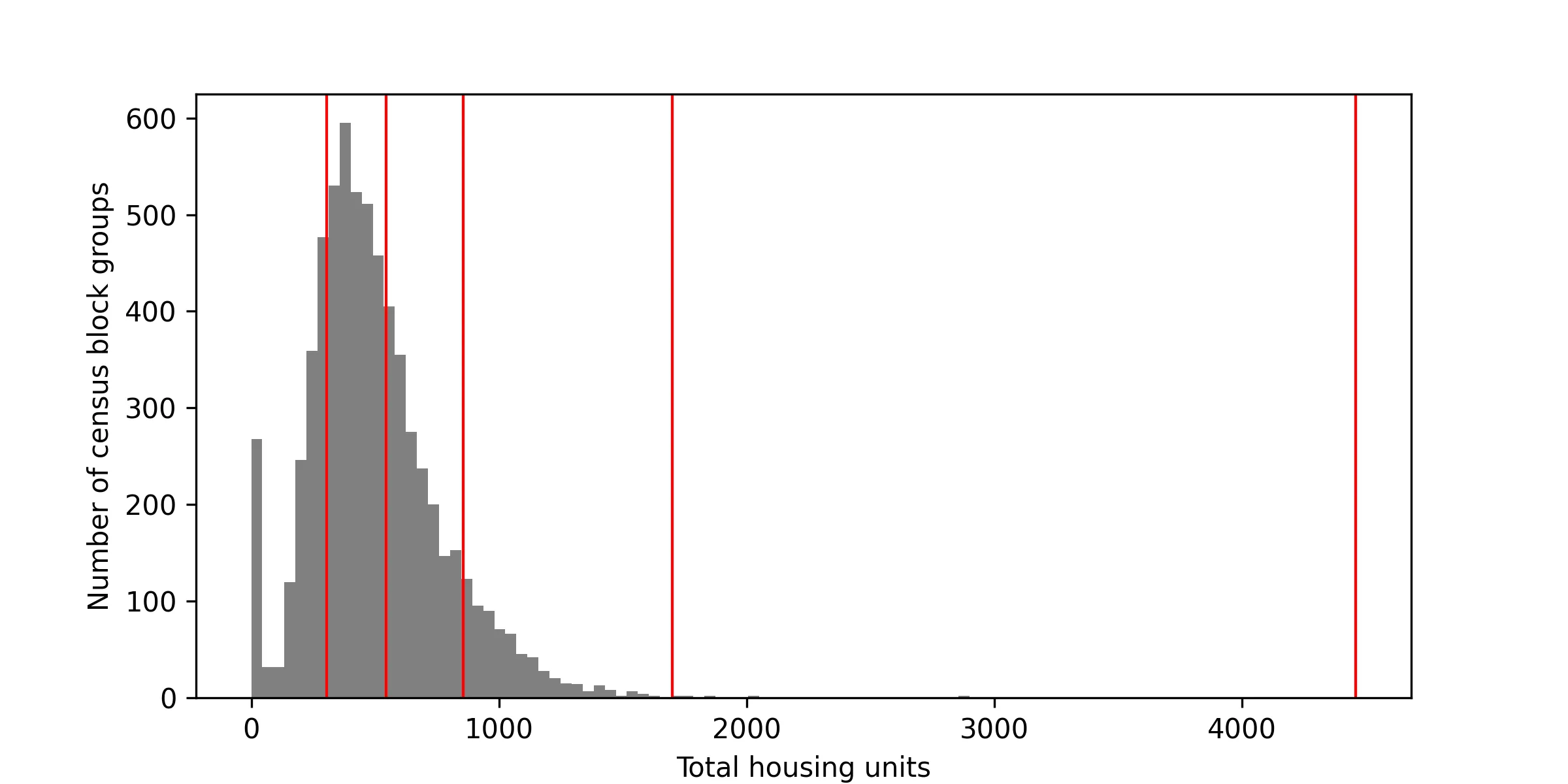 *
*
Experiment with changing the classification scheme you have chosen and redrawing the histogram to see how differently they divide your data. Quantiles, EqualInterval, and StdMean are good ones to compare. The full list is in the mapclassify documentation.
A note on natural breaks: NaturalBreaks begins from a random starting point, so your class breaks will shift slightly each time that you run it, and they will not exactly match the breaks that QGIS finds. FisherJenks always returns the same, optimal, breaks but can take a minute or so to run on a dataset of this size. Once you have a set of breaks that you are happy with you can fix your map to them by replacing the scheme and k options with scheme="UserDefined" and classification_kwds={"bins": classes.bins}. Having said that, the variance is usually quite small and you can ignore it for the purposes of this tutorial.
Next, change the rendering of the block groups so that you can see the tree canopy raster from tutorial 01 underneath your census block groups. QGIS does this with a blending mode. matplotlib does not have blending modes, so we will instead make the block groups partly transparent with the alpha option.
The land cover dataset describes all of New York City in 3 foot cells, which is far too much data to read into your notebook at once (QGIS quietly handles this for you by only drawing the cells that it needs for your current view). We will therefore zoom in to an area of upper Manhattan, as you did in tutorial 01, and read only that part of the raster, at a reduced resolution. As in tutorial 01, cells with a value of 1 are tree canopy, so we hide all of the other values.
import rasteriofrom matplotlib.colors import ListedColormapfrom rasterio.windows import from_bounds
# the area to map, in the coordinates of EPSG:2263 (feet)# we could alternately construct these values from the bounding box of a geometry or set of geometries, e.g. `block_groups.loc[0, "geometry"].bounds`xmin, xmax, ymin, ymax = 985000, 1005000, 222000, 246000
with rasterio.open("data/original/Land_Cover_2010/landcover_2010_nyc_3ft.img") as src:    window = from_bounds(xmin, ymin, xmax, ymax, transform=src.transform)    landcover = src.read(1, window=window, out_shape=(1200, 1000))
# hide every cell that is not tree canopycanopy = np.ma.masked_where(landcover != 1, landcover)
fig, ax = plt.subplots(figsize=(8, 8))# limit the raster image to the area of interest and color it dark greenax.imshow(canopy, extent=(xmin, xmax, ymin, ymax), cmap=ListedColormap(["darkgreen"]))
# plot the block groups on top of the raster, using the class breaks you found above# we can decorate the legend with keyword arguments, including a title, the format of the numbers, and the location of the legend (without the location, it will cover the map)joined.plot(    ax=ax,    column="AQSQE001",    scheme="UserDefined",    classification_kwds={"bins": classes.bins},    cmap="Greys",    alpha=0.6,    legend=True,    legend_kwds={"title": "Total housing units", "fmt": "{:.0f}", "loc": "upper left"},)ax.set_xlim(xmin, xmax)ax.set_ylim(ymin, ymax)ax.set_axis_off()
Layers are drawn in the order that you add them, so the tree canopy is drawn first and the block groups are drawn on top of it. set_xlim() and set_ylim() are the equivalent of zooming in the QGIS map canvas: change the four numbers at the top to look at a different part of the city.
Your map should look something like this:
Normalized choropleth map of values
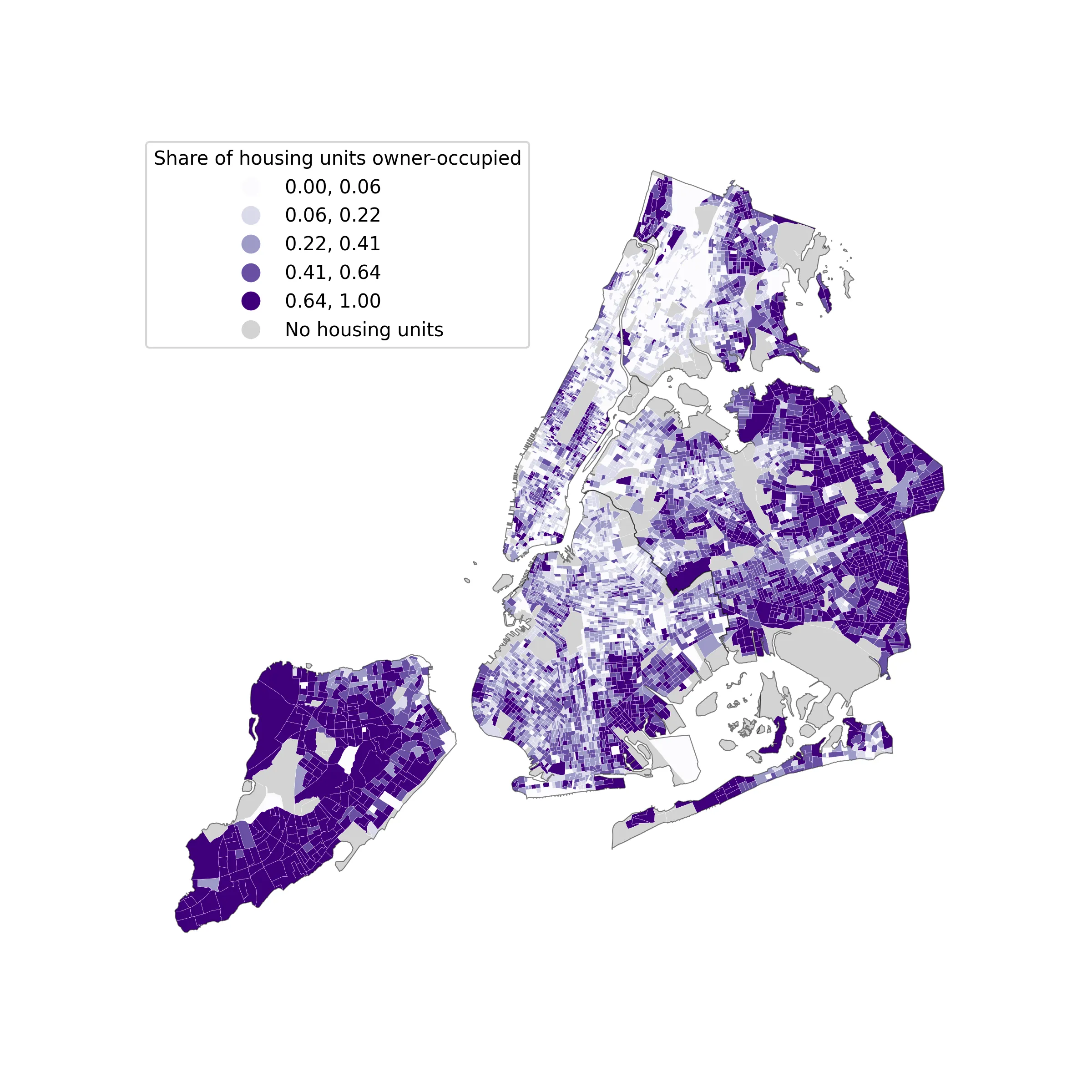
Next you will make a map of the percentage of owner-occupied housing units in each census block group — aka the number of owner-occupied housing units normalized by the total number of housing units in each census block group.
In QGIS you would write this as an expression in the Expression Builder. In pandas you instead calculate a new column, which works like the Field Calculator. In the case of this example we are dividing the total number of owner-occupied housing units by the total number of housing units.
joined["pct_owner"] = joined["AQSQE002"] / joined["AQSQE001"]joined["pct_owner"].describe()Some census block groups (parks, cemeteries, airports) have no housing units at all. Dividing zero by zero has no meaningful answer, so pandas records the result for these block groups as missing (NaN). The missing_kwds option below tells GeoPandas how to draw them, so that they are not confused with block groups where no one owns their home.
Make your choice of classification scheme and color ramp, and map your new column.
ax = joined.dissolve("COUNTYFP").boundary.plot( edgecolor="black", linewidth=0.5, alpha=0.5, figsize=(8, 8))joined.plot( ax=ax, column="pct_owner", scheme="Quantiles", k=5, cmap="Purples", edgecolor="white", linewidth=0.1, legend=True, legend_kwds={ "title": "Share of housing units owner-occupied", "fmt": "{:.2f}", "loc": "upper left", }, missing_kwds={"color": "lightgrey", "label": "No housing units"},)ax.set_axis_off()Your map should look something like this:
Dot density map
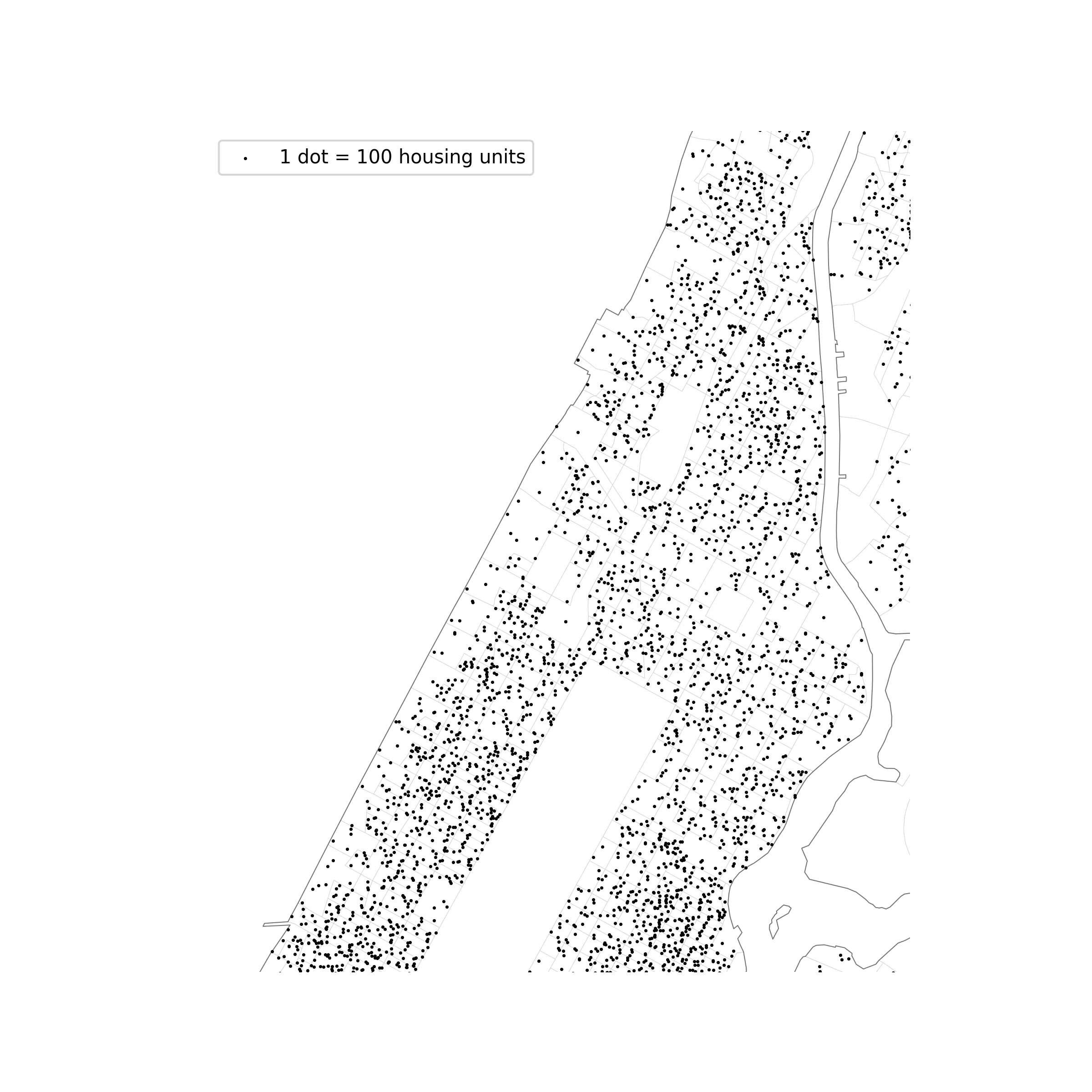
Next you will generate a dot density map to communicate the number of housing units using a proportional number of dots to the actual number of housing units in the census block group.
Dot density maps can be powerful ways to show concentrations in ways that have less emphasis on rigid lines between given boundaries. See this example from cartographer and historian of science Bill Rankin; these from map maker Eric Fischer and this from data visualization expert Jia Zhang.
To create a dot density map showing the number of housing units in each census block group you will use a GeoPandas method called sample_points(). This is the equivalent of the Random Points Inside Polygons tool in QGIS: it will create a new vector dataset with a specified number of points placed at random locations within given polygons.
First calculate the number of points to place in each census block group. Take the field from your dataset representing the total number of housing units and divide this number by 100. This will mean that there is 1 dot created for every 100 housing units (you can experiment with different values in the denominator here to get your desired density of dots). The number of points must be a whole number, so we round the result.
n_dots = (joined["AQSQE001"] / 100).round().astype(int)n_dots.sum()Then generate the points.
points = joined.sample_points(size=n_dots, rng=42)points = points[~points.is_empty]dots = gpd.GeoDataFrame(geometry=points.explode(ignore_index=True))print(len(dots))print(dots.crs)There are three steps here. sample_points() returns one feature for each census block group, containing all of that block group’s points together. The second line removes the block groups that received no points. explode() then separates the points, so that each dot is its own feature. rng=42 fixes the random placement so that you get the same dots each time that you run the cell. Remove it to get a different arrangement every time.
Draw the dots on top of the outlines of the census block groups, zoomed in to the same area as before:
ax = joined.dissolve("COUNTYFP").boundary.plot( edgecolor="black", linewidth=0.5, alpha=0.5, figsize=(8, 8),)joined.plot( ax=ax, facecolor="none", edgecolor="lightgrey", linewidth=0.2,)dots.plot( ax=ax, markersize=0.5, color="black", label="1 dot = 100 housing units",)# set the legend at the axis levelax.legend(loc="upper left")ax.set_xlim(xmin, xmax)ax.set_ylim(ymin, ymax)ax.set_axis_off()Your map should now look something like this:
Like a temporary layer in QGIS, the dots you have generated are stored only in the temporary memory of your notebook. If you shut down your notebook they will be deleted. This is helpful to avoid producing many datasets while you adjust parameters (such as the number of dots) to obtain your desired result.
But once you have a result you are happy with, to retain the data after closing your notebook you must save it as a new vector dataset.
The new points take their coordinate reference system from the census block groups, which you confirmed above with print(dots.crs) (you should use EPSG:2263 for any maps of NYC). Specify a location to save your new dataset and give it a name.
dots.to_file("data/processed/nyc_housing_units_dots.fgb")Your new vector dataset of points representing the number of housing units in each census block group in New York City is now saved, and can be opened in QGIS or read into another notebook.
Composing your map
Now experiment with any of the above symbology methods to create a map of your choice expressing something about housing in NYC. Your map must include the standard map elements outlined in the layout portion of tutorial 01, and be exported as a PDF.
In place of the QGIS print layout, in matplotlib you move from map space to paper space by setting the size of your figure in inches. The example below composes the dot density map on a portrait 8.5x11 page with a title, a legend, a scale bar, a north arrow, a note showing the projection, and citations for the data sources. Use it as a starting point for your own map.
from mpl_toolkits.axes_grid1.anchored_artists import AnchoredSizeBar
# set the font type to TrueType so that it is editable in Illustrator.# The default is Type 3, which sets all type objects as a bitmapplt.rcParams["pdf.fonttype"] = 42
# page size in inches: swap the numbers for a landscape pagefig, ax = plt.subplots(figsize=(8.5, 11))
joined.plot(ax=ax, facecolor="whitesmoke", edgecolor="lightgrey", linewidth=0.3)dots.plot(ax=ax, markersize=1, color="black", label="1 dot = 100 housing units")ax.set_xlim(xmin, xmax)ax.set_ylim(ymin, ymax)ax.set_axis_off()
# title and legendax.set_title("Housing units in Upper Manhattan", loc="left", fontsize=16)ax.legend(loc="upper left", frameon=False, markerscale=4)
# scale bar: the units of EPSG:2263 are feet, so 5280 units is 1 milescale_bar = AnchoredSizeBar(    ax.transData, 5280, "1 mile", loc="lower right", frameon=False, size_vertical=40)ax.add_artist(scale_bar)
# north arrowax.annotate(    "N",    xy=(0.95, 0.97),    xytext=(0.95, 0.90),    xycoords="axes fraction",    ha="center",    va="center",    fontsize=14,    arrowprops={"arrowstyle": "-|>", "color": "black"},)
# data sources, projection, and cartographerfig.text(    0.1,    0.06,    "Data: 2018-2022 American Community Survey 5-year estimates, via IPUMS NHGIS.\n"    "Projection: NAD83 / New York Long Island (EPSG:2263). Map by: your name",    fontsize=8,    va="top",)
fig.savefig("tutorial02_map.svg", bbox_inches="tight")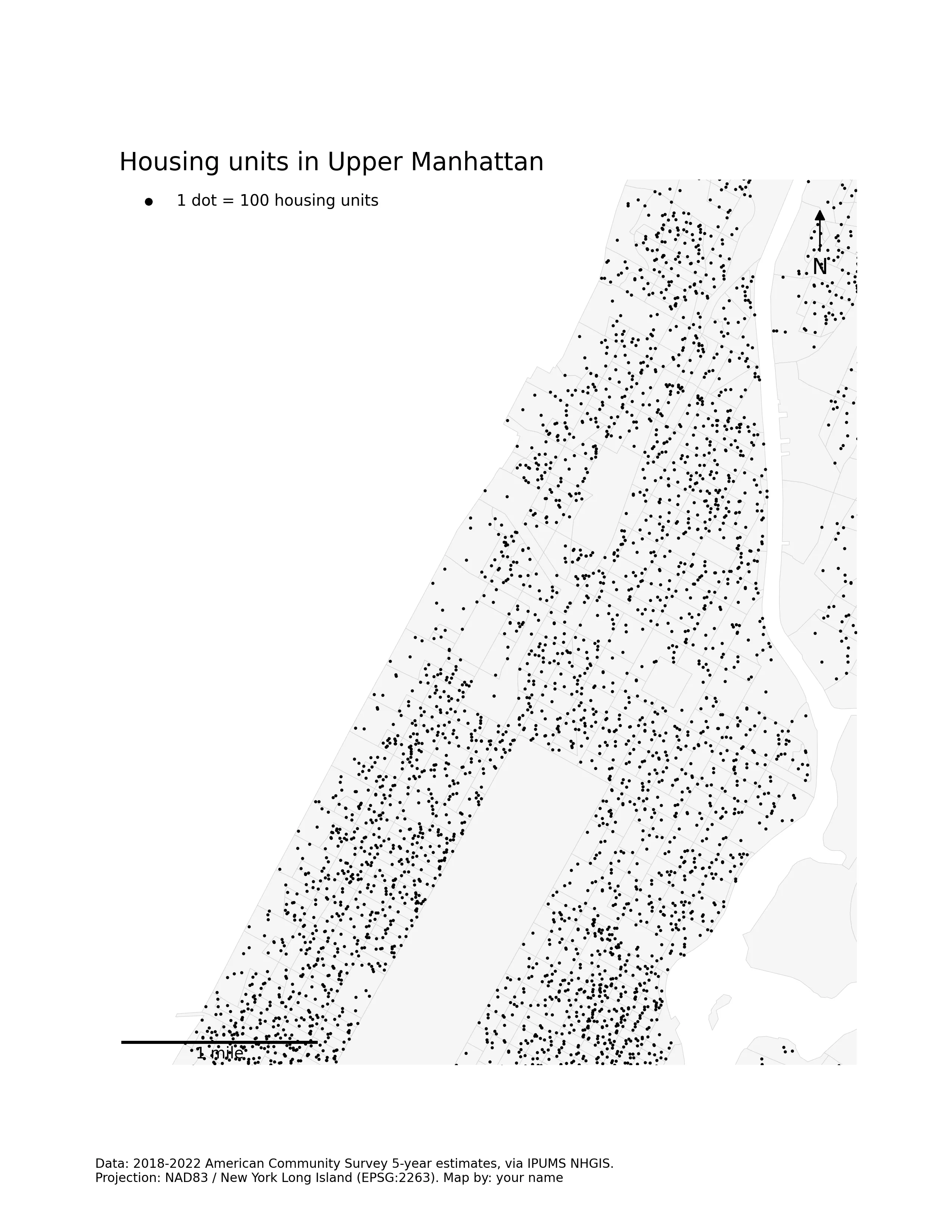
A choropleth map drawn with legend=True already has a legend, so if you compose one of your choropleth maps you can leave out the ax.legend() line. As discussed in the notes on workflow in tutorial 01, you may prefer to set up only the page size, scale, and orienting map elements here and continue your design work in a graphics editing software. Saving with the .svg extension in place of .pdf will give you a file with editable vector-based data for Illustrator. Keep in mind that a lot of the detail-oriented design work you may want to do is easier in a graphics editor than in matplotlib, so you may want to use this approach for your final map.
Upload one map to canvas that uses quantitative symbology to convey information about housing in NYC composed as a 8.5x11 page (landscape or portrait orientation) exported as a PDF. Your map must include standard map elements outlined in the layout portion of tutorial 01.