05 Geoprocessing
This tutorial will ask you to investigate the distribution of internet data centers across the lower 48 states of the US. You will use a range of vector processing tools to manipulate point and polygon data. Note that while we will not be able to make claims about the volume of data stored or processed from these materials, we will begin to appreciate how the internet depends upon a network of physical locations. This entrypoint will allow us to practice a range of geoprocessing techniques.
Deliverables
Please submit one 8.5 x 11 map expressing some combination of population / population density and presence / absence / proximity to data centers. You can focus on the lower 48 states as a whole or zoom in to a particular metro region. Provide a legend and title your map accordingly.
Data
In this module you will be mapping data centers with reference to populated and unpopulated areas across the US. As such, you will need:
- a point location dataset of data centers across the US
- US Counties with population, to be able to explore distribution of data centers relative to population
- Core-Based Statistical Areas to further contextualize data center location relative to major urbanize areas.
Exercise
Setting up your project
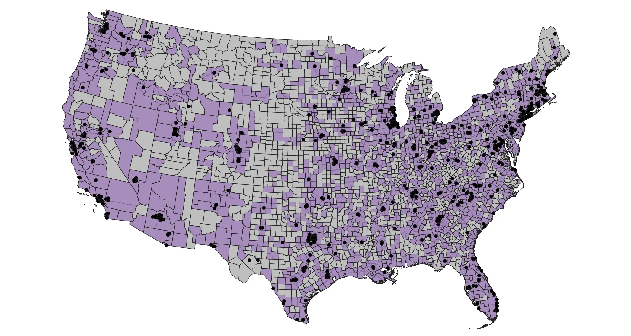
Add your data to the map, organized such that you can appreciate the general distribution of data centers and urbanized areas relative to counties. Notice that counties toward the west coast are more square and regular compared to counties east of the Mississippi River. Furthermore, notice that there are large swaths of area not included in CBSA polygons, suggesting those areas are largely depopulated.
Calculating attribute data
Turn off the CBSA layer (we will return to it later) and open the attribute table of the counties layer. This layer has been pre-processed to include the total population of each county according to the 2022 American Community Survey. We will use this attribute, along with each county’s area, to contextualize the distribution of data centers.
From the top menu bar, select Vector > Analysis > Count Points in Polygon.... Add the counties layer as the polygons, and the data centers as the points.
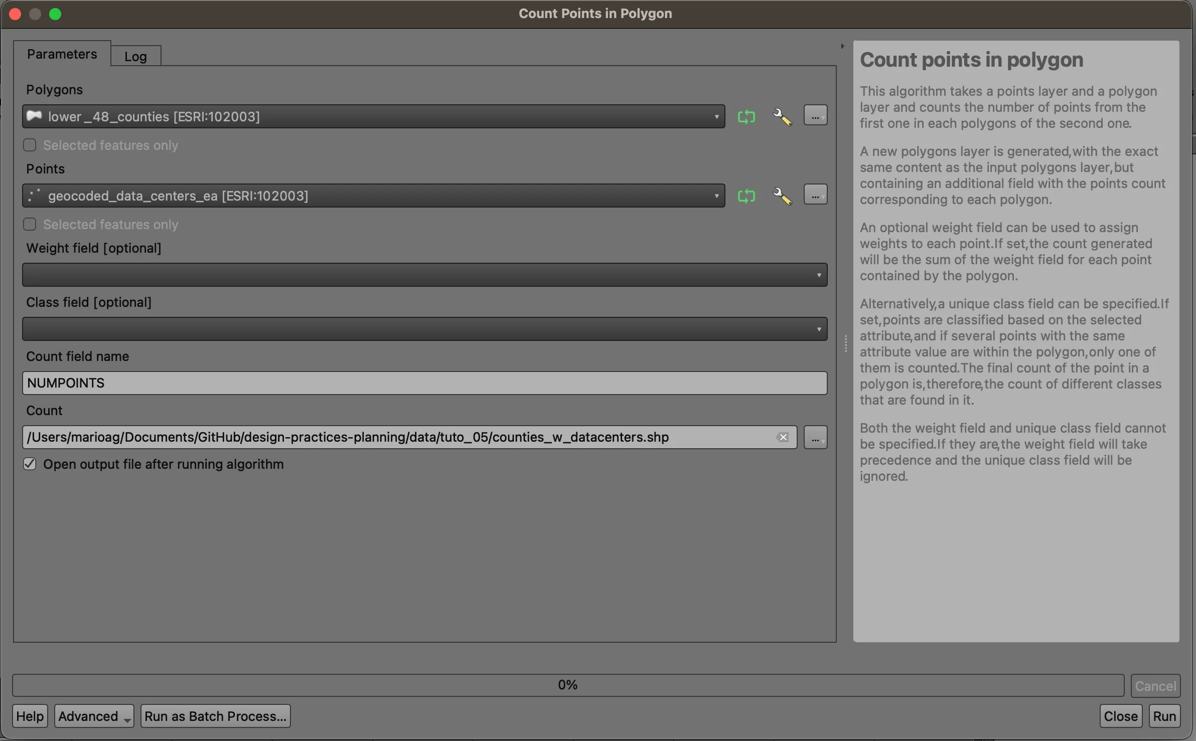
Save the output with your other data layers. We will use this new layer moving forward.
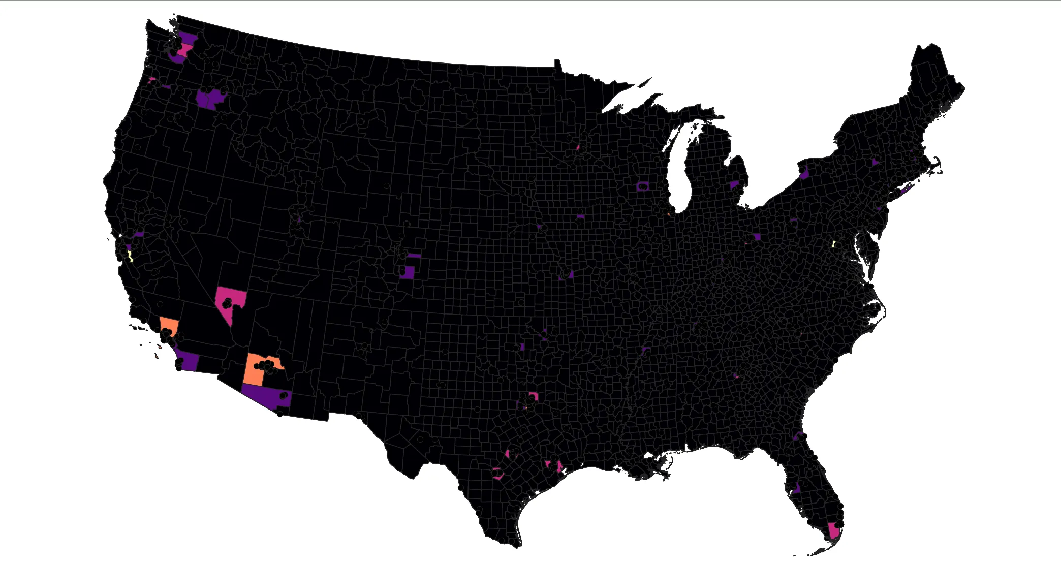
Open your new layer’s attribute table, and scroll to the right. You’ll see a new field, NUMPOINTS, that corresponds to the number of data centers in each county. (Remember that we cannot make any claims into the volume of data or footprint of data center, just it’s presence). Click the column name to sort the values. We can see that Loudon County, VA has 114 data centers per this dataset.
Double-click on the layer name in the table of contents. Navigate to the Symbology tab, and then select to visualize using a Graduated scale. Choose the NUMPOINTS field from the dropdown, and then select Natural Breaks (Jenks) from the Mode dropdown. Optionally change the color ramp, and click Classify.
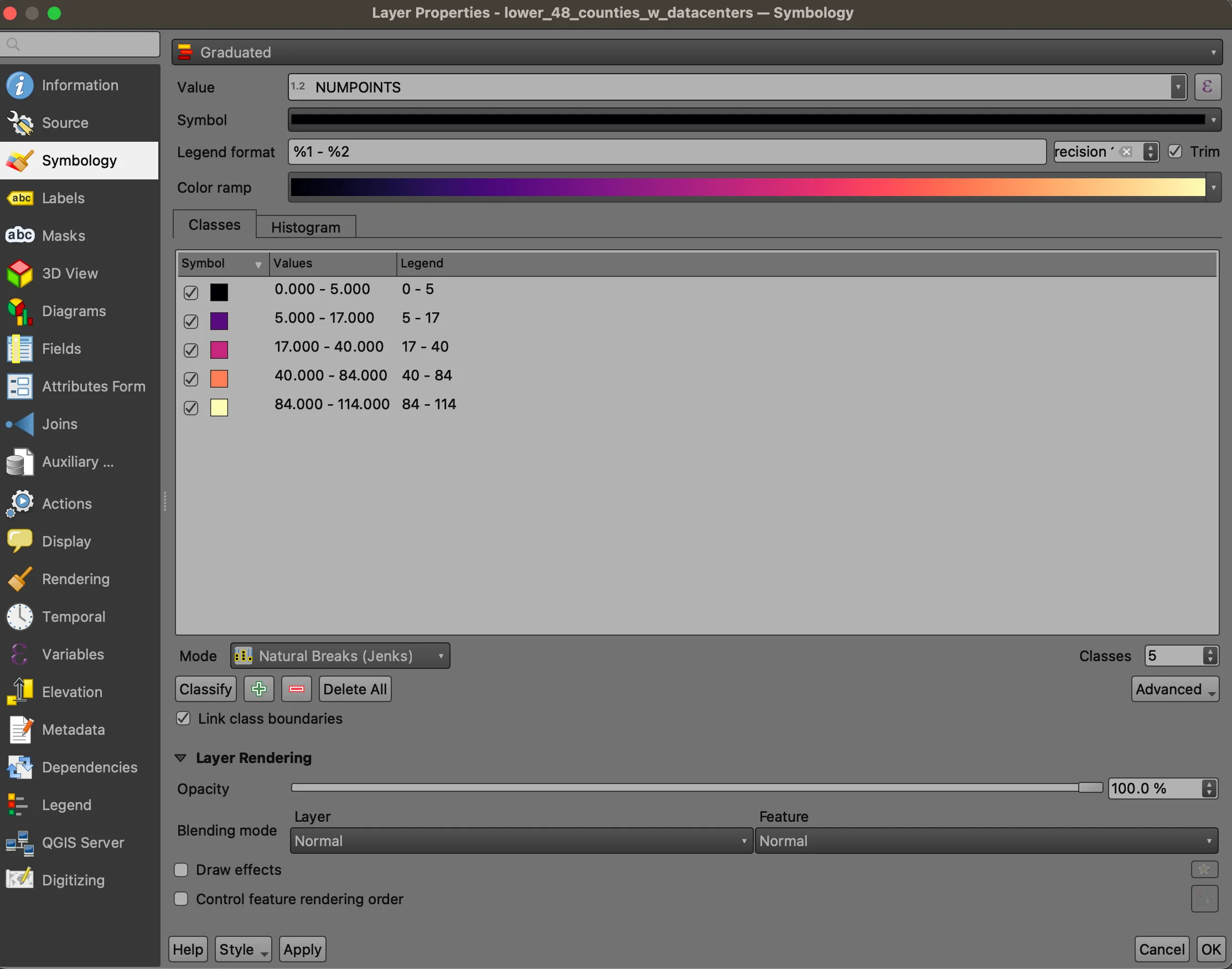
“Natural Breaks” is an algorithm that finds clusters within a 1-dimensional numeric dataset. It is useful for understanding the “shape” of the data, and can help identify extreme values in a dataset.
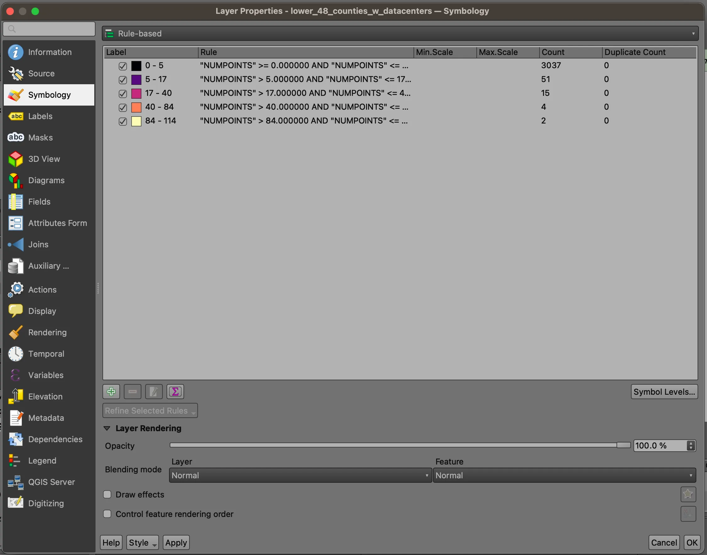
Navigate up to the dropdown where we chose Graduated previously. Select Rule-Based. This mode keeps whatever symbology that had previously been applied, but allows us to calculate basic statistics (along with providing more complex symbology rules). Click the Count Features button (∑), and observe the Count field. We see that the distribution of data centers is quite concentrated in tens of counties.
Click OK, and return to the map. You’ll see that most of the map is the the color of your lowest break, with certain high-count counties scattered across the country.
Providing context
Let’s put this data center information in context with county-level population. Right click on the counties dataset you just styled and select Duplicate Layer. Toggle the first layer off and turn this layer on. Double-click on the layer name to open the symbology window again.
This time, we will normalize population by area. Select Graduated from the dropdown again, and paste the following expression into the Value field:
to_int( "pop_AQNFE0" ) / ("ALAND" / 2.788e+7)
This expression has three main components:
to_int()converts"pop_AQNFE0", which is natively stored as astring, so we can use it as a numerator("ALAND" / 2.788e+7)converts the land area field, expressed as square feet, to square miles- that denomenator is used to normalize
pop_AQNFE0, the total population field reported byNHGISfor 2022, to arrive at the county level population density.
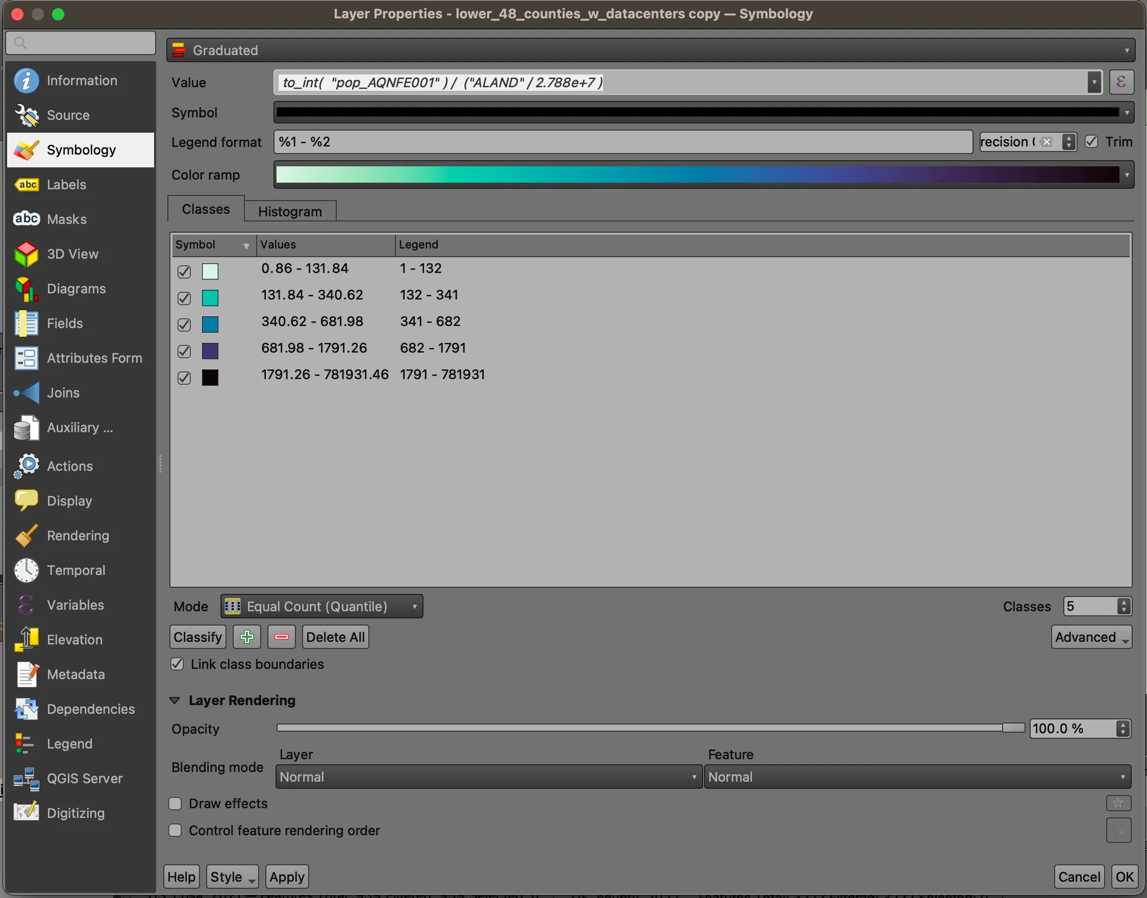
For this map, we’ll use a Quantile scheme, which sorts the chosen value and splits features into equal groups based on the chosen number of groups. Practically speaking, this means the densest 20% of counties are in the darkest color group, the next 20% densest are in the second group, and so on. As the name suggests, the default is 5. Click OK and return to the map.
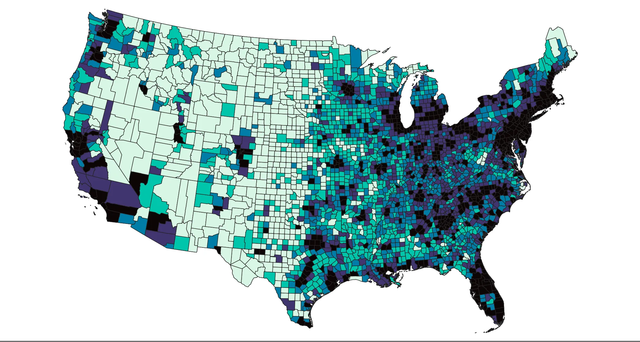
As you might expect, the population density does not clearly match the distribution of data centers. In the following steps, we will use geoprocessing techniques to explore and visualize this data further.
It’s important to note that the choice to use quantiles instead of natural breaks or some other scheme dramatically changes what the map looks like- keep this in mind!
Determining the closest data center
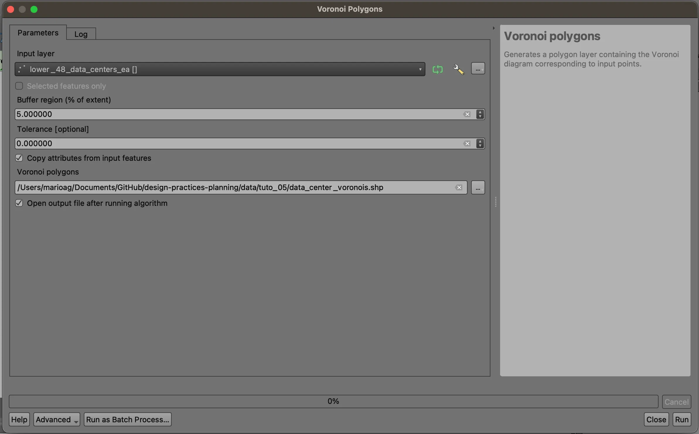
Voronoi Polygons can be used to better understand the spatial distribution of a phenomenon represented as points. This analysis tool creates polygons in which any location in that polygon is closer to the input point than any other point. Navigate to Vector > Geometry Tools > Voronoi Polygons.... Use the data centers layer as the input, add a five percent buffer, and save your result.
Note that this conception of distance is simplistic and does not account for factors such as road networks, natural barriers, or even how infrastructure (like data centers) is distributed across the landscape. However, it is a useful first step in understanding the spatial concentration of point features.
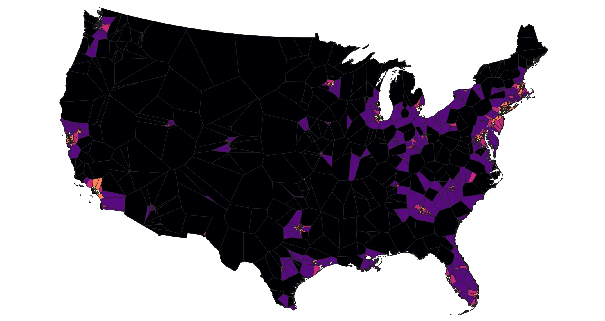
Inspect your result- it may be easier to interpret if you change the layer symbology to only show outlines. Take a moment to zoom around and inspect urban and not so urban areas.
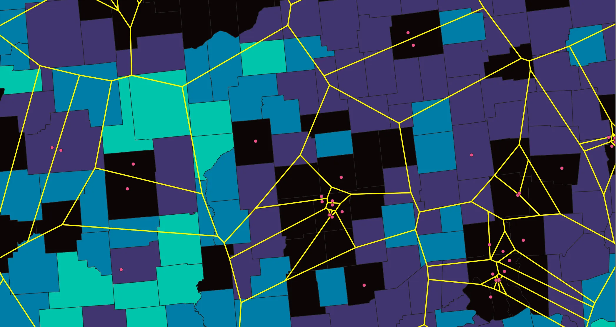
In this example, these Voronoi polygons show all the areas closest to each data center; any area in each polygon is closest to the point around which the polygon is drawn.
These zones cut across counties. In the following step, we will estimate the population closest to each data center by apportioning population from county geometries into the Voronoi geometries. To do this we will need to modify the geometries some.
Preparing the Voronoi zones
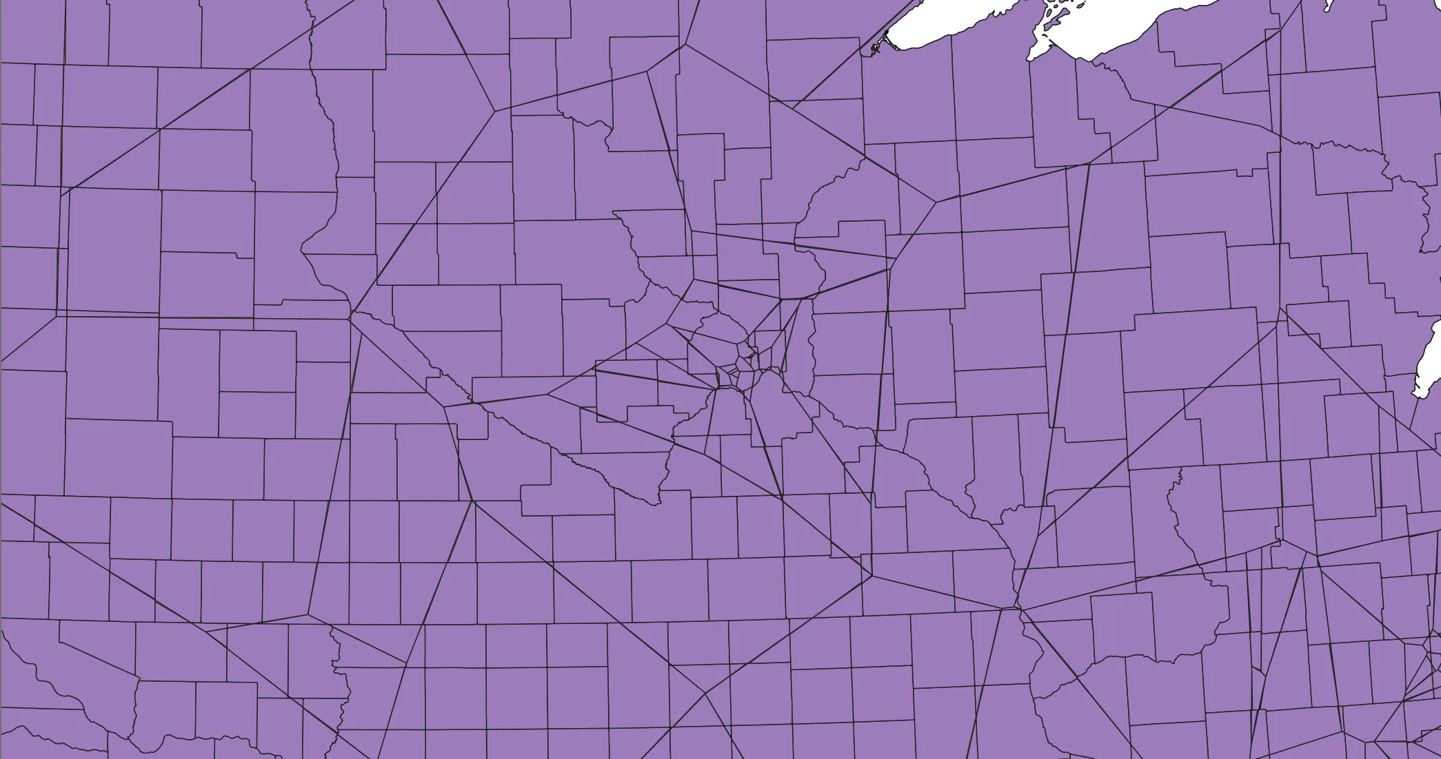
Zoom back out to see the entire study area. By design, the Voronoi polygons extend beyond our study area thanks to the 5% buffer we added, as well as the natural shape of the features. We will clip the polygons to the states outlines.
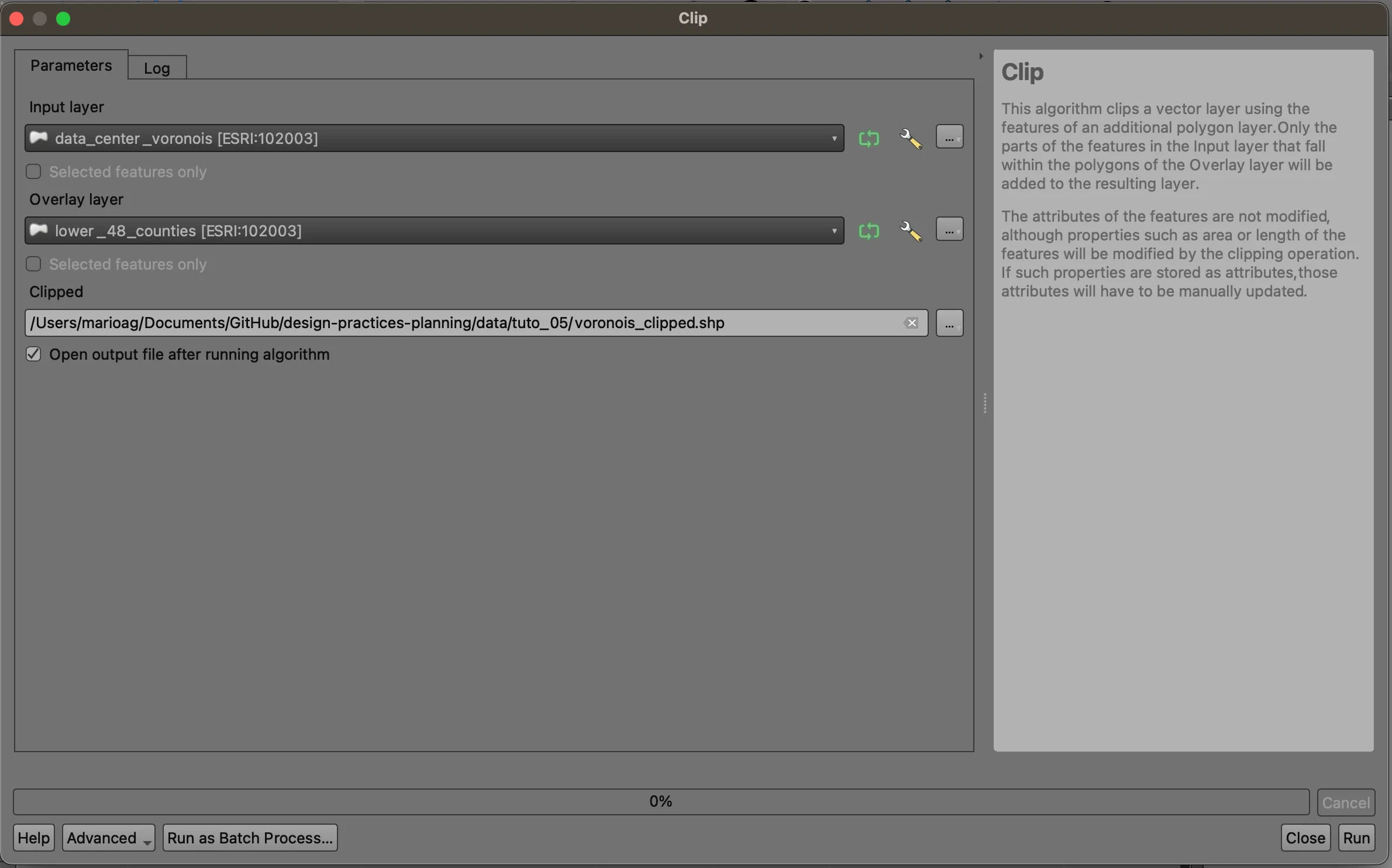
Navigate to Vector > Geoprocessing > Clip.... Set the input to your Voronoi layer, and use the states dataset as the overlay layer. This will allow us to extract only the pieces of the Voronoi polygons that fall within the states layer- imagine a cookie cutter removing excess batter. Save your results. Note that due to the scale and complexity of this task, it may take a few minutes to complete.
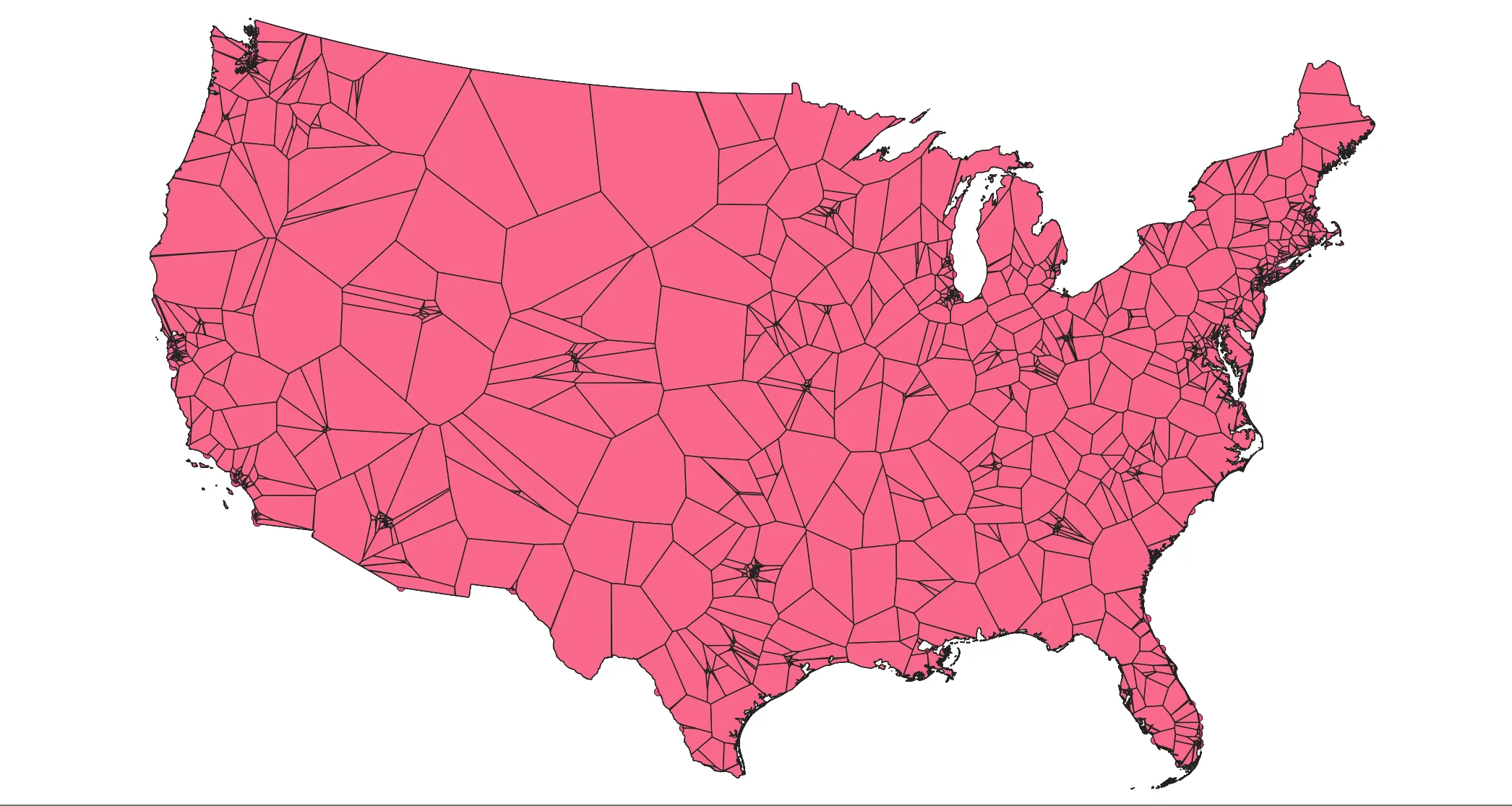
The results should look like the following:
Proportional Split
Oftentimes, spatial units do not match between datasets and we must rely on assumptions to convert between scales- in our case, counties do not align with our Voronoi polygons. Proportional Splitting involves splitting a feature and assuming that the attribute of interest is distributed evenly across the polygon. In this case, that means that we assume that if you split a county in half, regardless of the cut line, that 50% of the population would reside in either half.
This assumption has its drawbacks- as we saw based on our population density maps before, population is very unevenly distributed- however, outside of preprocessing zones to exclude areas where there is assumed to be no people, like water features, or identifying buildings and developing algorithms to assign population, this rational method is widely used to provide estimates. You can read more about proportional splitting here.
Open the clipped layer’s attribute table. Click on the Field Calculator (abacus) button, which will open a tool that will let you calculate each clipped polygon’s area.
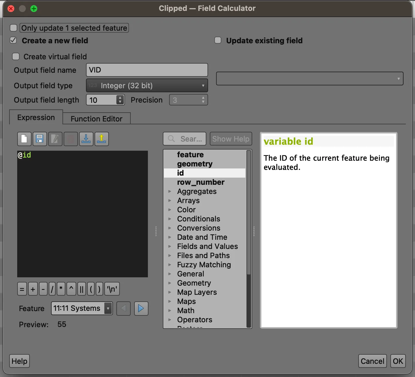
We are calculating a new unique ID field for the clip features, so we are able to correctly identify which county parcels belong to each Voronoi polygon. You can choose whatever name you’d like, but here VID = Voronoi ID.
Open the attribute table of your counties layer. Census GIS files are prepared with a number of helpful fields, among them ALAND, AWATER, and Shape_Area. Shape_Area represents the entire area of the geometry, whereas the first two represent the area comprised of water or land. This information is extremely helpful in understanding or using land area vs. total area.
Many shapefiles do not have such information. We will create a new field called tot_area, which will come in handy later during our splitting. Set the field type to Decimal number (real) to match the field type of the Shape_Area field.
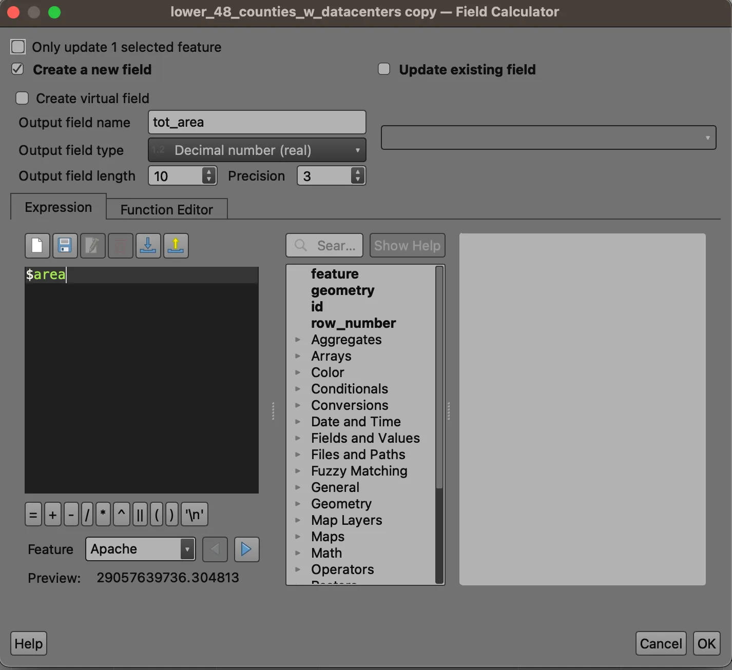
We will need this as a reference once we divide features based on Voronoi boundaries.
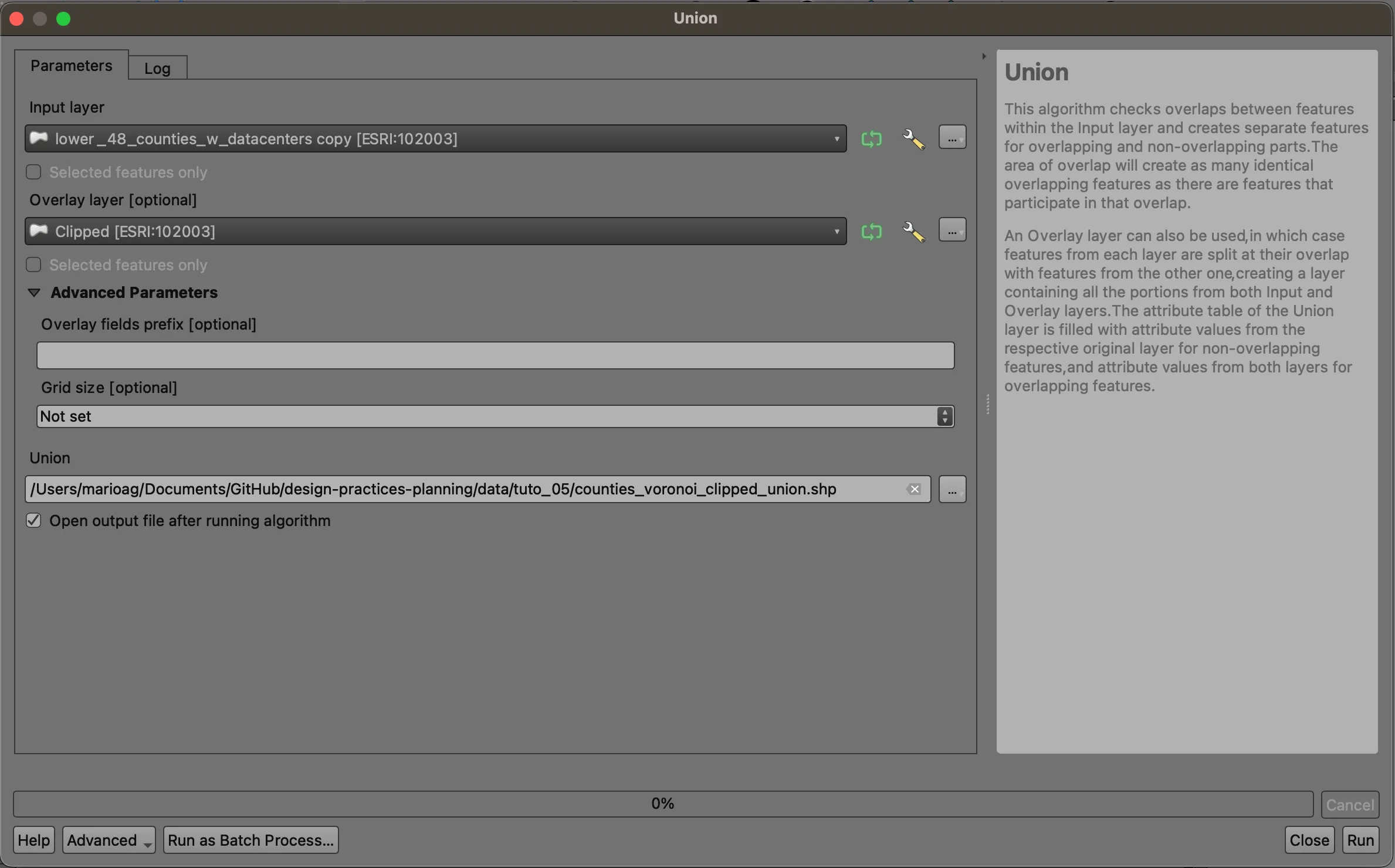
Union
Close the attribute table, and navigate to Vector > Geoprocessing > Union.... We will use this tool to combine the clipped and attributed Voronoi polygons with the attributed county polygons. We will use our counties as the input layer, and the clipped features as our overlay layer. Save your result to your data directory. Note that this is a very complex operation and will likely take a few minutes to complete.
Zoom in and look around. The county polygons have been split by the Voronoi polygons. If you open the attribute table, you’ll notice a greater number of total features: every time a county is split by a Voronoi polygon, (at least) two new features are created, each having the attributes of the county and the clipped polygon it falls inside of. That means that each part has the entire county population as an attribute!
It is at this point that we’ll split the population proportionally based on the size of each part. Open the new layer’s attribute table, and open the Field Calculator again. We will create a new field called part_area, which represents the area of the unioned polygon. Counties that fell completely within a Voronoi zone will have the same area, but most will have a somewhat different area.
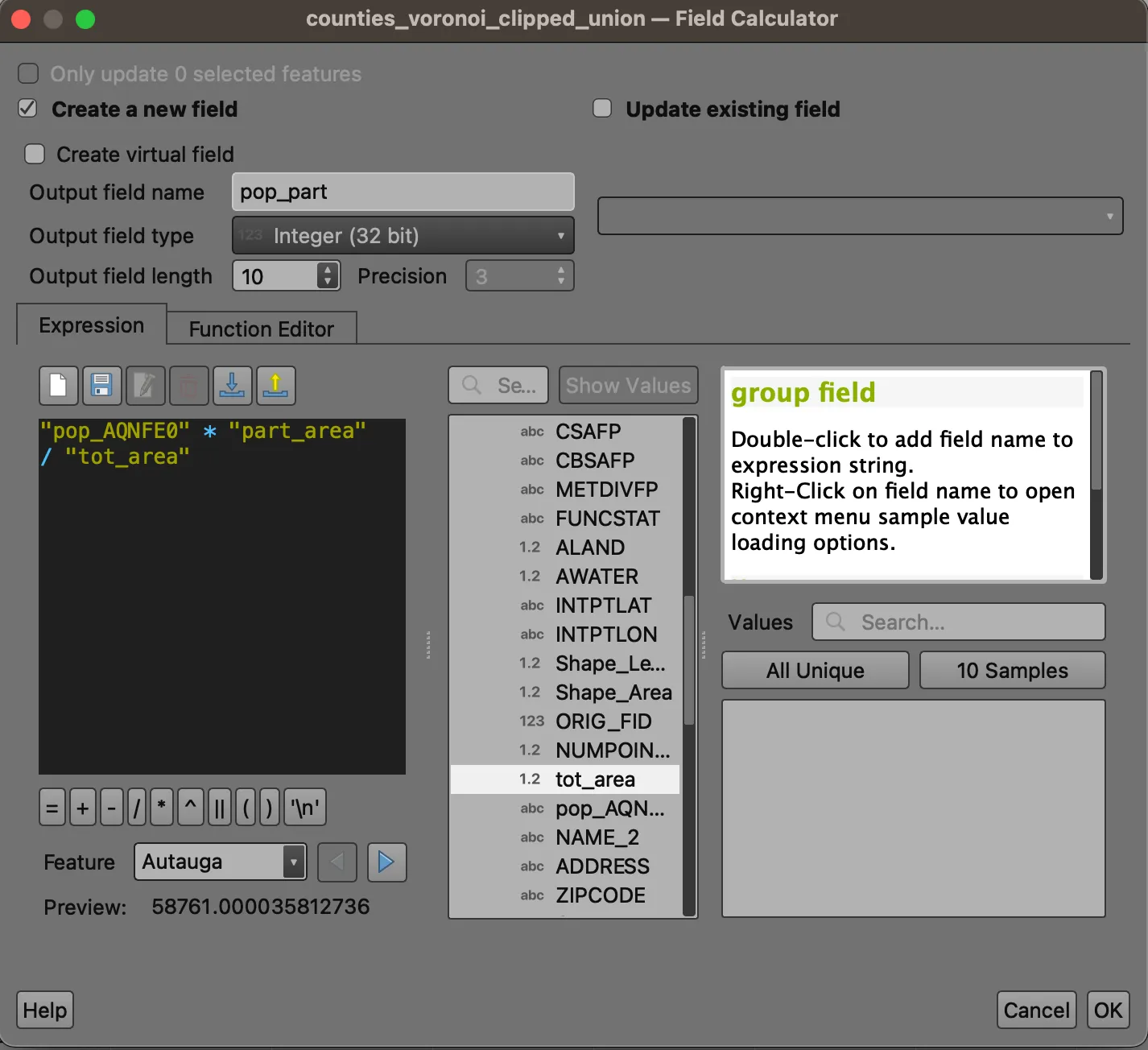
We can use the field, along with the tot_area field, to apportion county population evenly between parts. Open the Field Calculator a last time. Create a new field called pop_part, and enter the following expression:
pop_AQNFE0 * part_area / tot_area
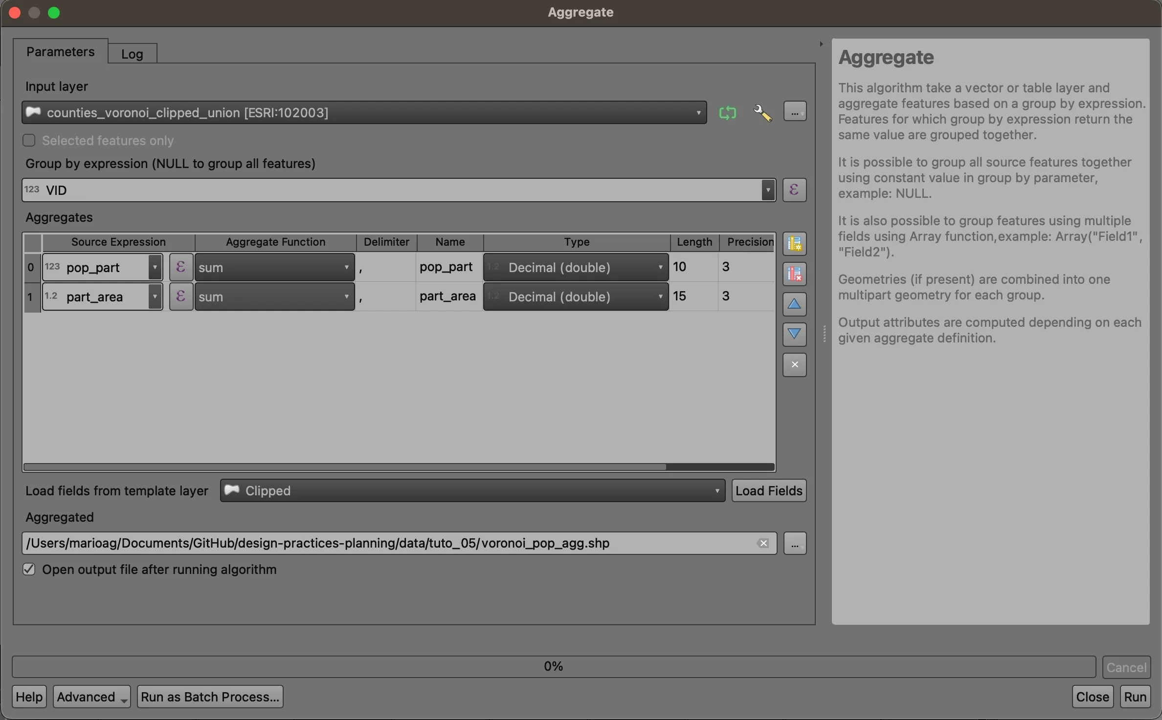
Aggregate
Open the Processing Toolbox (Processing > Toolbox). Search for the Aggregate tool. Choose VID from the Group by expression dropdown, and remove all but the pop_part and part_area fields. Be sure to switch the field types to double and increase the length of the area field. Save your output to your working directory.
Wrapping Up
We have used a variety of geoprocessing tools to explore and transform datasets. To wrap up, visualize the apportioned Voronoi polygons based on total population per zone or total population (refer to the representation techniques practiced above). How do the different visualization methods inform what story is told (i.e. quintiles vs. natural breaks, population vs population density)?
Deliverables
Please submit one 8.5 x 11 map expressing some combination of population / population density and presence / absence / proximity to data centers. You can focus on the lower 48 states as a whole or zoom in to a particular metro region. Provide a legend and title your map accordingly.