07 Raster Analysis
For tutorial 7 you will select and complete one of the following three exercises. (You are of course welcome to complete more than one but only one is required.)
-
option 1: Change mapping with land use rasters, see below for tutorial covering basics of raster math operations and mapping land use change
-
option 2: Making Data from Satellites where you will create false color composites with Landsat satellite imagery
-
option 3: Making Data from Aerial Imagery where you will download high resolution aerial imagery from google maps based on point locations
Mapping change
In this tutorial you will use land use land cover raster data and raster math operations to map change in agricultural lands in New York state between 2001 and 2016.
Deliverables
One map expressing land use change in some portion of New York State.
Data
Exercise
Open a new QGIS project and add the two land use land cover datasets.
Reclassify rasters
You will create a map of change in the amount and extent of agricultural land between 2001 and 2016.
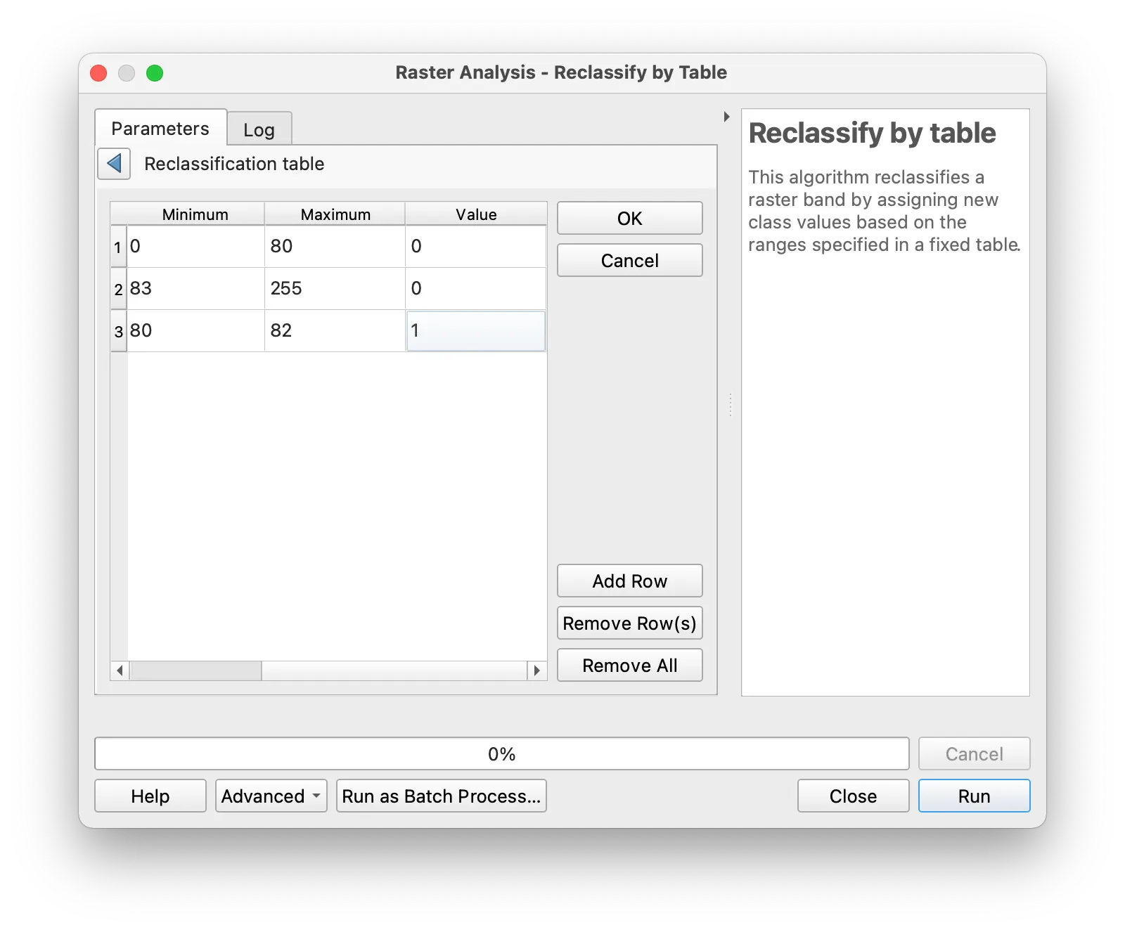
To do this you will first reclassify each of the raster datasets so that all agricultural land has a value of 1 and all non-agricultural land has a value of 0.
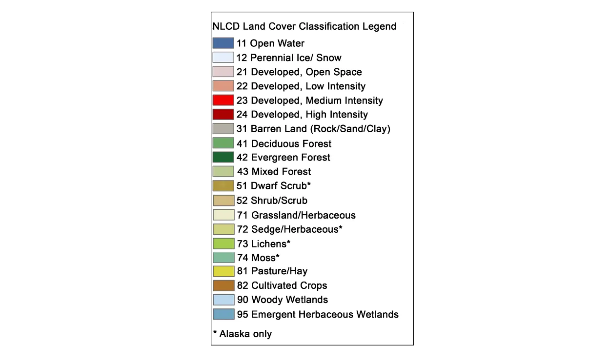
First take a look at the metadata describing what land use type each value in the land use land cover raster corresponds to. This is provided with each of the years of data that you downloaded and is shown below. Notice that values of 81 and 82 correspond with Pasture/Hay and Cultivated Crops. These are the two categories we will focus on in this tutorial.
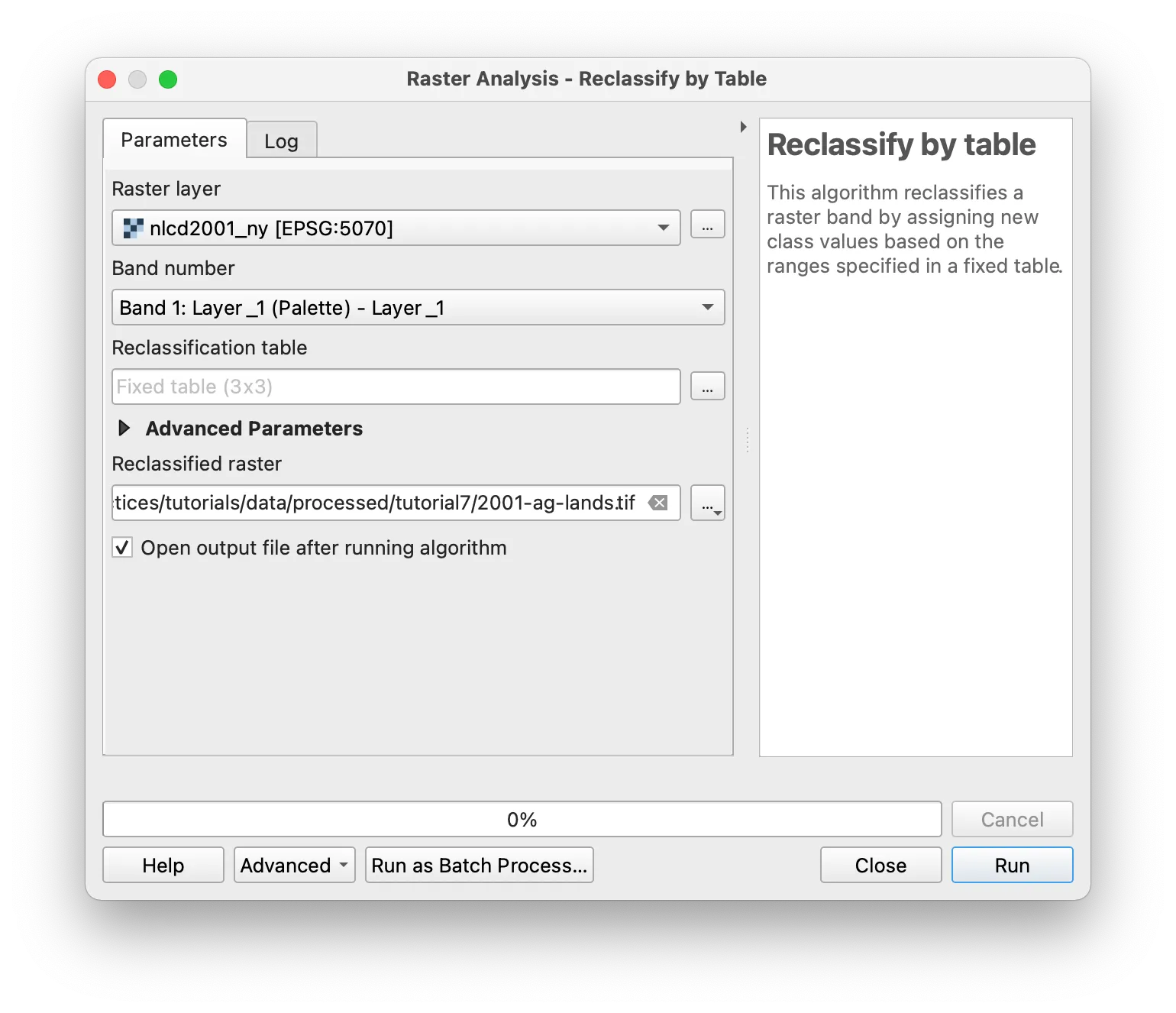
Open the Processing Toolbox. Search for Reclassify by Table or expand the Raster analysis section and find the Reclassify by Table tool.
Launch the tool. Then select the raster you wish to reclassify. Specify where you would like to save your reclassified raster dataset. Then use the ... button to open the reclassification table menu.
Define a reclassification table so that values associated with agricultural lands are set to be 1, and all other values are set as 0.
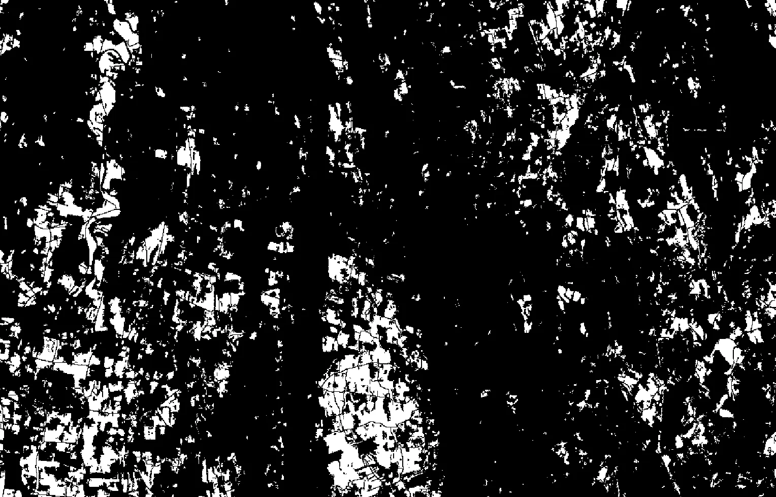
Your results should appear on your map as a raster dataset with values of 0 or 1. Values of 1 indicate that the area either belongs to the Pasture/Hay or Cultivated Crops category.
Repeat the same process for the second year of data.
Raster math
Next you will identify areas of change in agricultural lands between 2001 and 2016 by subtracting the two reclassified rasters.
Open the Processing Toolbox. Search for Raster calculator or expand the Raster analysis section and find the Raster calculator tool.
Select the two reclassified rasters as the input layers. Select a location to save your resulting output raster layer. Then select the epsilon to write your expression.
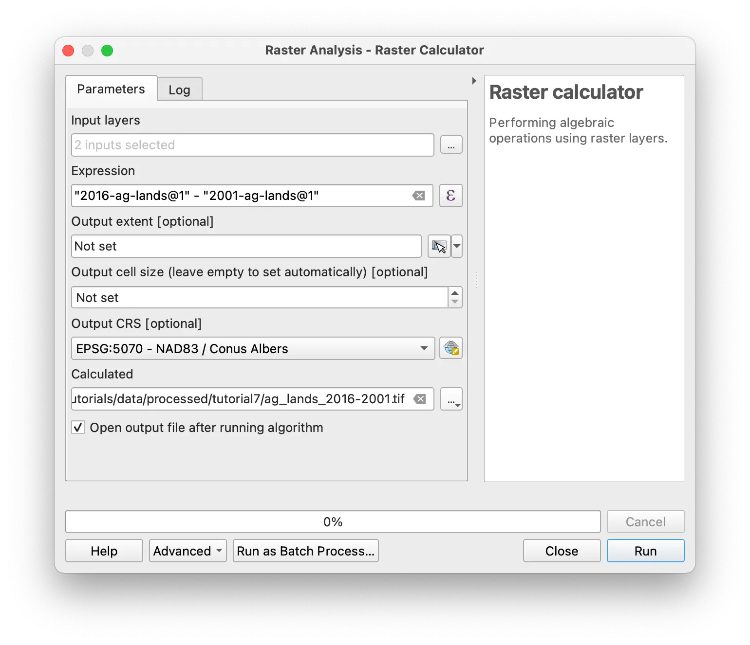
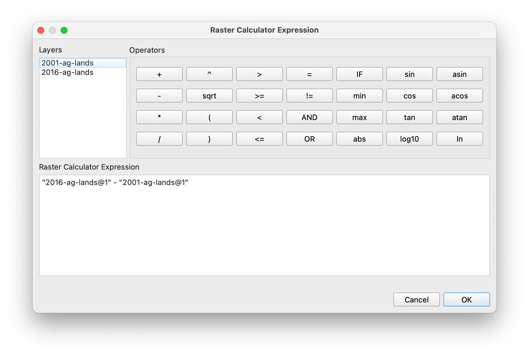
In the calculator menu that appears construct the expression shown below to subtract the two raster datasets from one another and create a dataset showing change in agricultural lands. By subtracting 2001 agricultural land from 2016 agricultural land values of -1 in the output will correspond with loss of agricultural areas, and values of positive 1 will indicate new agricultural areas present in 2016 that had other land uses in 2001.
Symbolize
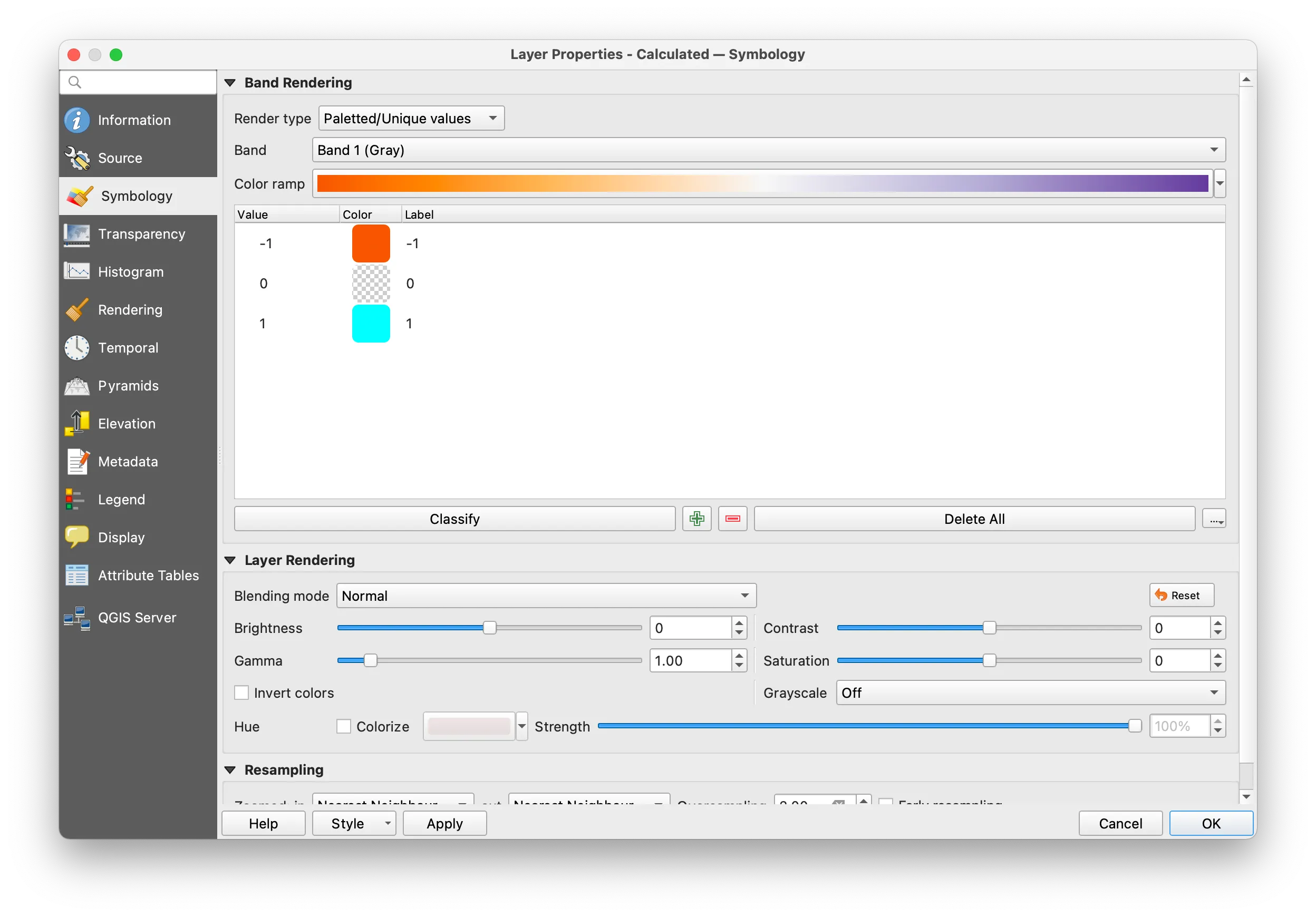
Open the output raster’s layer property menu and change the symbology for paletted / unique values. Click Classify and then select a color ramp. You may choose to adjust the symbology for all 0 values to be transparent by right clicking on the color square for that value and selecting Change opacity.
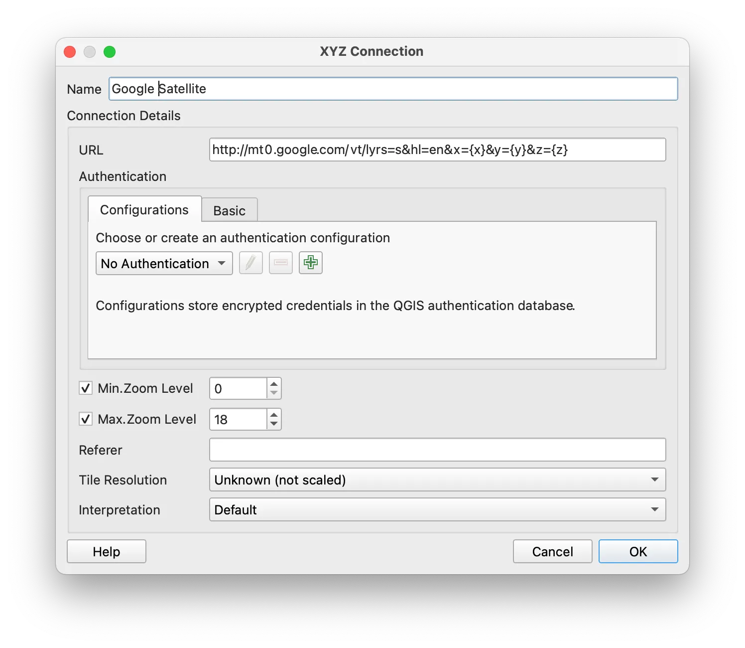
To visualize your areas of change in agricultural lands in context add Google-provided true color satellite imagery to your project by adding a new XYZ Tiles layer with the following URL: http://mt0.google.com/vt/lyrs=s&hl=en&x={x}&y={y}&z={z}
Pan and zoom to find areas with a high amount of change in agricultural lands.
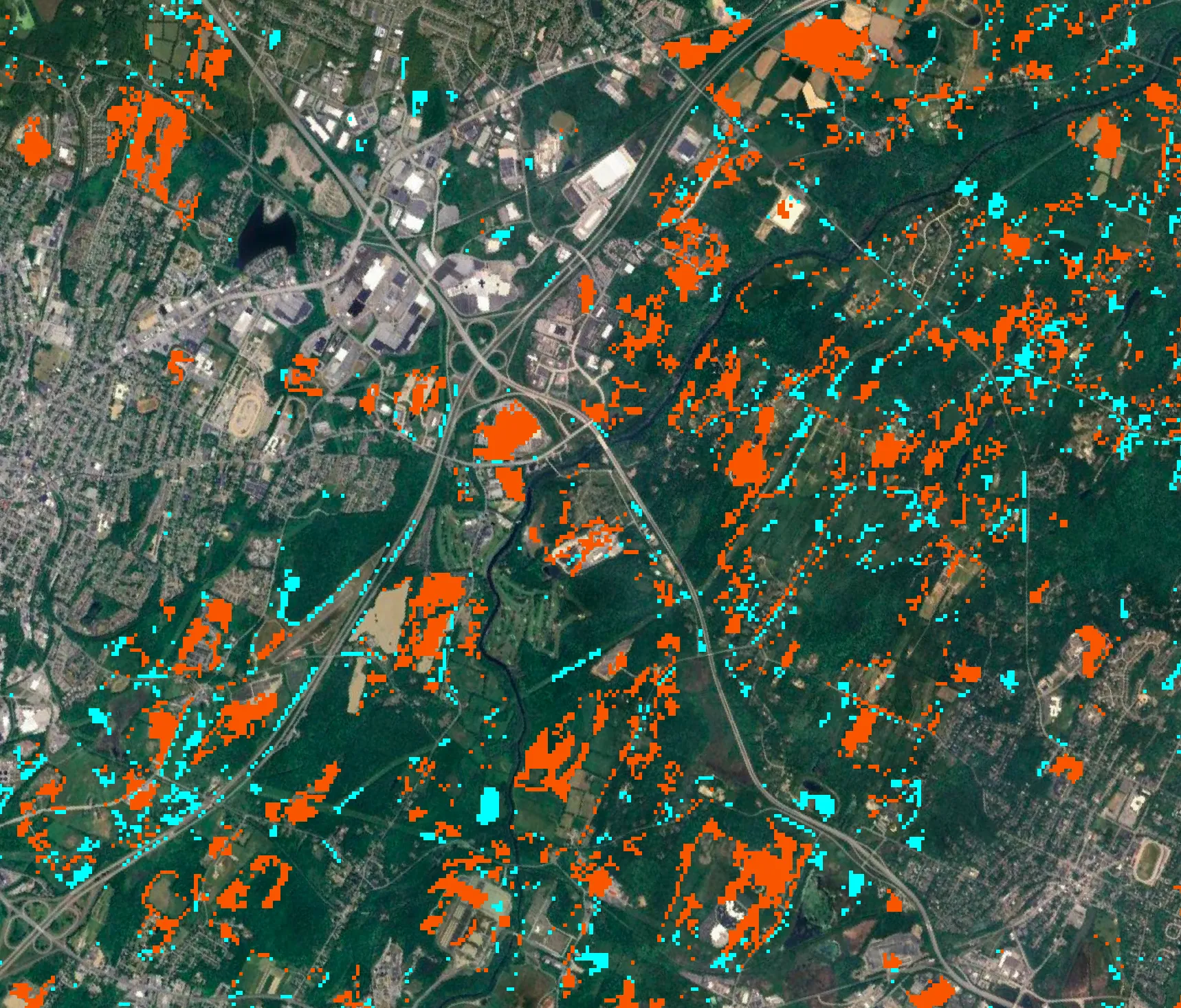
Deliverable
Design a map depicting land use change for some portion of New York State. Upload to canvas.