08.3 Interactive Mapping Part 3
Additional Representation in Webmapping
This tutorial will cover a few additional ways of styling map layers in your interactive maps using the provided astro-maplibre-template.
Setting color values for categorical data
One way to style your map layers is to set the color of each feature based on a field in the dataset that contain hex color values. This method is especially well suited to data-driven symbology for categorical values.
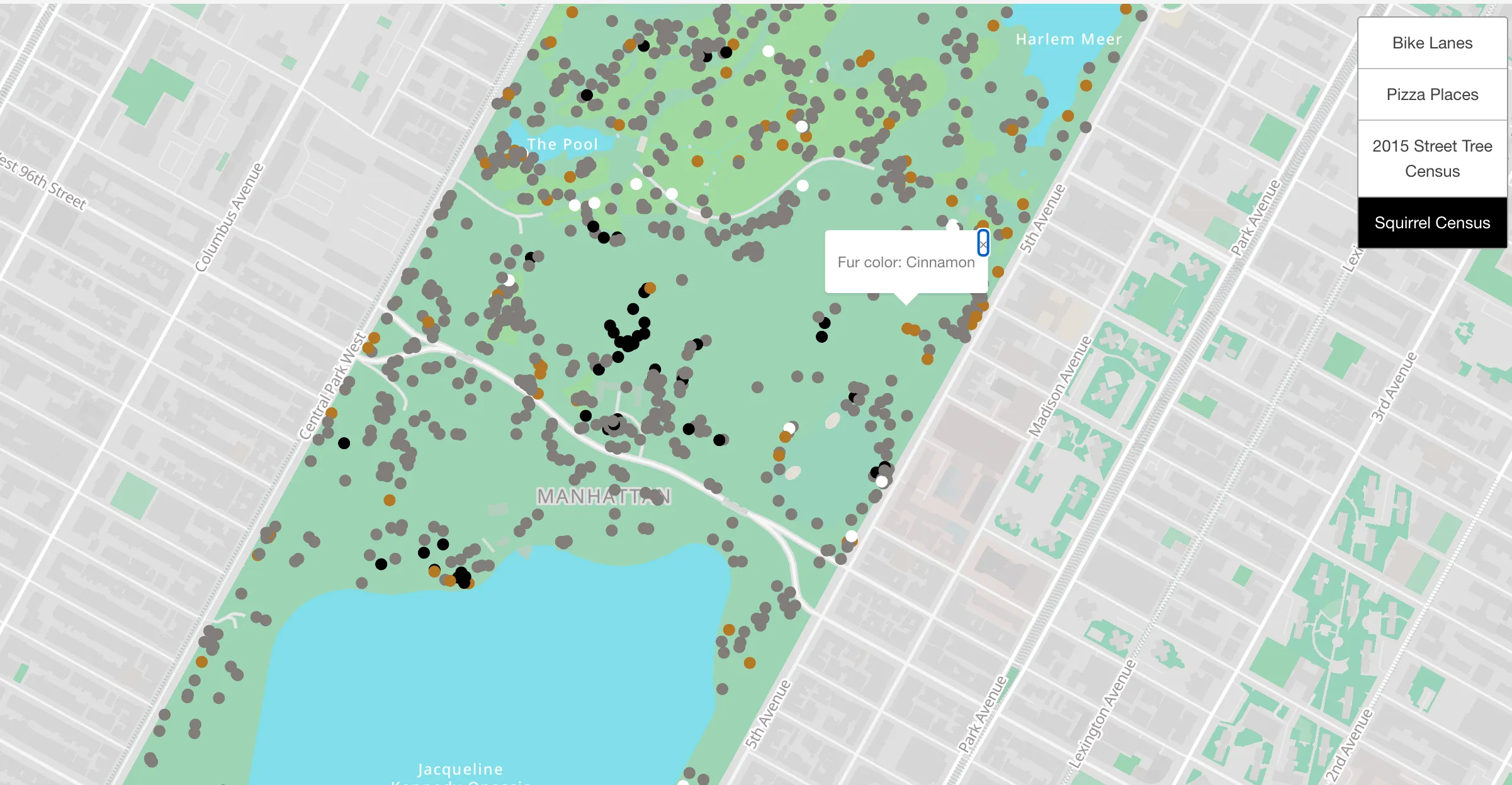
For example you could choose to assign colors to each record in the NYC Squirrel Census based on the observed fur color of the squirrel. (This dataset is included in the astro maplibre template in the public/data/ folder so you can use it to test out the following steps if you would like)

To accomplish this requires the following steps:
- Determine the colors you wish to use and the values that they will be based on in your data
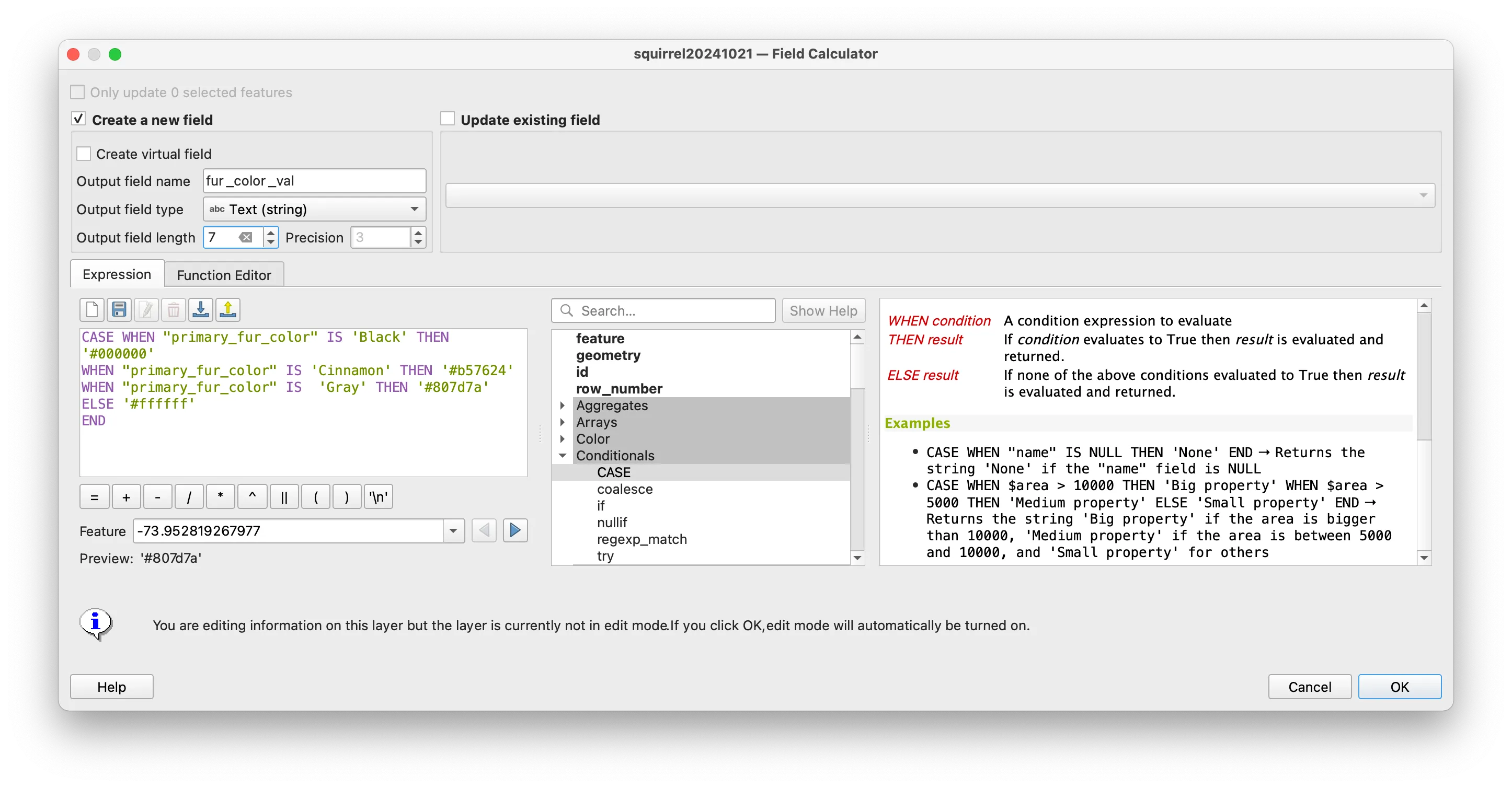
- Open your dataset in QGIS and use the field calculator to create a new field that contains color values based on a conditional statement. For the squirrel color example this looks like the following:

- Once you have calculated your new field save your dataset (and export as a geojson file using WGS84 as its coordinate reference system if it is not already in this form).
- Add your dataset to the
public/datafolder of your template repo. - In the map of your choice use get syntax to assign the colors you defined to the circle for each record. The example below shows the syntax to add this layer to the
_full_page_map_components.yamlfile:
- id: 'squirrel' label: 'Squirrel Census' toggle: true visible: false data-type: 'geojson' layer-type: 'circle' url: './data/squirrel20241021.geojson' paint: ## this is get syntax ## 'fur_color_val' must the name of the ##field that contains the color values you ##would like to be assigned. circle-color: ['get','fur_color_val']- To add the mouse behavior you can add the following just below the circle-color parameter:
mouseEvent: - type: "click" content: - p: - str: "Fur color: " - property: "primary_fur_color" else: "N/A"Your map should now show features from the squirrel census colored according to the recorded fur color of each squirrel.
Step functions and assigning attributes based on data
Another core styling approach is to adjust the size and/or color of features on you map based on the numeric values of a given field in your data.
The following walks through examples of how to set color and then size of each feature in your dataset based on values from your data.
Assigning symbol size based on data values
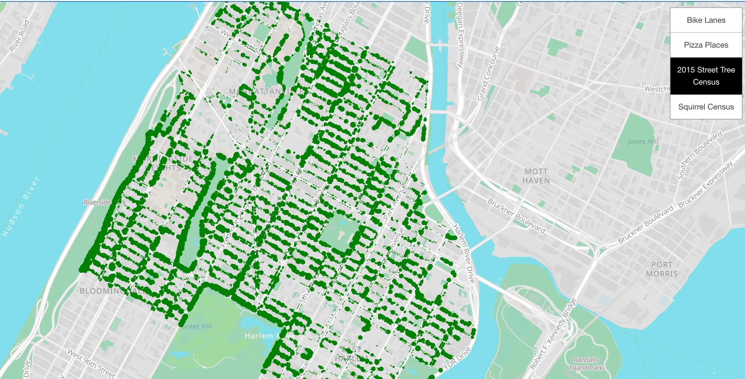
This example shows how to create graduated symbols to show varying tree size for street trees in Harlem and Morningside Heights.

To implement this example you would follow the following steps.
- Open the Harlem subset of the street trees file you worked with in tutorials 1 and 2 and export it as a geojson file with WGS 84 as its coordinate reference system.
- Add this file to the
public/datafolder of your webmap repository. - Add this file to the end of your desired map yaml file and use a
step expressionto assign the size of each circle based on the tree diameter field in the dataset. This should look like the following addition to your yaml file:
- id: 'trees' label: '2015 Street Tree Census' toggle: true visible: true data-type: 'geojson' layer-type: 'circle' url: './data/2015_Street_Tree_Census_subset_um.geojson' paint: circle-color: 'green' circle-radius: [ 'step', ['get','tree_dbh'], .5, ##size for all values < first value 3, 1, ## value, size of circle, 8, 2, 12, 3, 15, 4, 25, 5, ## this line says for any tree ##with a diameter greater than 25 inches ##use a circle with a radius of 5 ]In this example all trees with a diameter of between 3 and 8 inches will have a circle radius of 1.
Assigning colors based on data values
Assigning colors based on data values follows the same process except the step expression is passed to the color parameter and color values are assigned for each grouping of data.

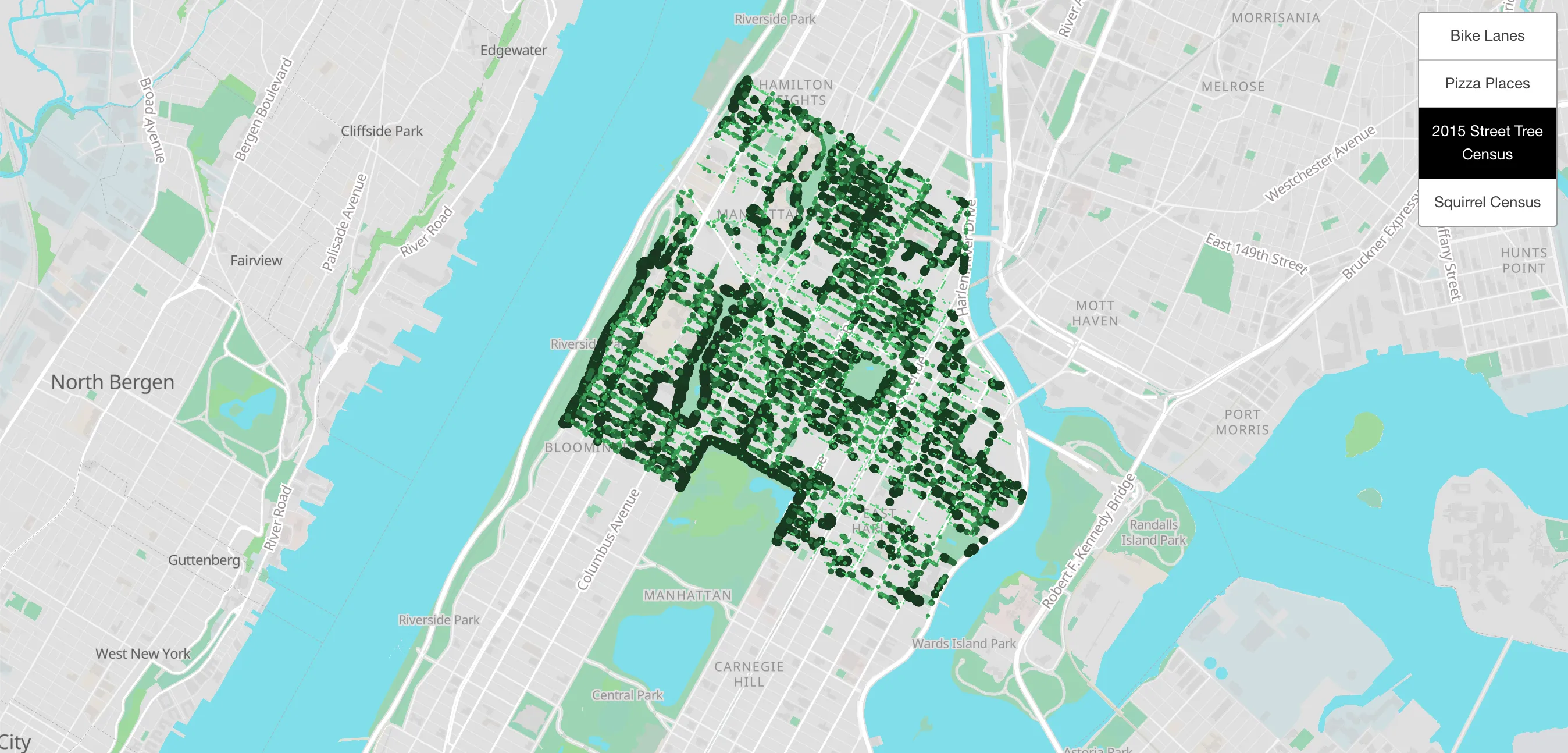
Building on the steps above the following shows how to adjust the color for each tree point based on its diameter.
Assuming you have already completed steps 1 &2 above and have added the street tree census file as a geojson which uses the WGS 84 coordinate reference system to the public/data folder within your webmap repository, you would add the following to your map’s yaml file:
paint: circle-color: [ 'step', ['get','tree_dbh'], '#5ef787', ## color for all values < first value 3, '#4ecf71', ##value, color, 8, '#3a9c54', 12, '#286b3a', 15, '#173d21', 25, '#1b3622', ]After adding the yaml code above he complete entry to add and style the trees layer as shown above will now be:
- id: 'trees' label: '2015 Street Tree Census' toggle: true visible: true data-type: 'geojson' layer-type: 'circle' url: './data/2015_Street_Tree_Census_subset_um.geojson' paint: circle-color: [ 'step', ['get','tree_dbh'], '#5ef787', ##color for all values < first value 3, '#4ecf71', ##value, color, 8, '#3a9c54', 12, '#286b3a', 15, '#173d21', 25, '#1b3622', ] circle-radius: [ 'step', ['get','tree_dbh'], .5, ## size for all values < first value 3, 1, ##value, size, 8, 2, 12, 3, 15, 4, 25, 5, ]